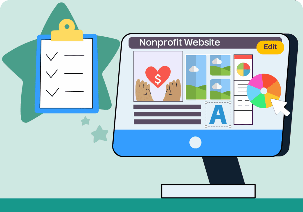

Are you about to embark on a website refresh for your organization?
Or maybe you’re launching a brand-new nonprofit website?
Either way, you’ve come to the right place.
A well-designed, well-written website can amplify your nonprofit’s mission and inspire action. Whether your goal is attracting new donors, recruiting volunteers or educating your community, your website should work hard for you. These 15 nonprofit website best practices will help you create a site that connects, converts and communicates your message effectively.
To guide you through, we’ve outlined the most important strategies for website branding, copy, design, navigation and conversions. We’ve also included real nonprofit website examples to inspire your next redesign.
What Should a Nonprofit Website Include?
Before we dive into the best practices, keep these must-have features in mind. Every effective nonprofit website should offer:
- A clear mission statement and value proposition
- Consistent branding across pages
- Impact stories with real-world outcomes
- Easy-to-use donation forms
- Prominent calls to action
- A mobile-friendly, responsive layout
- Simple navigation and intuitive menus
- SEO-optimized content
- Integration with social media and email marketing
- Accessibility features for all users
Whether you’re building your site from scratch or updating an existing one, these elements form the foundation of your nonprofit’s digital presence.
1. Maintain a Consistent Brand
Your website is the first impression most people have of your nonprofit – does it represent you well? Think of your website as the digital face of your organization. Is your nonprofit bright, colorful and casual with fun graphics? Or perhaps your branding is streamlined with a simple color palette and real photos to represent your mission. Regardless of the image your nonprofit shares with the world, this should be seen clearly and consistently on your website.
Think about it – if your nonprofit’s website looks outdated or inconsistent, visitors may question your credibility. You don’t want your home page and your donation page to look like two different organizations. A unified look and tone across every page helps users know what to expect, builds trust and reinforces your identity.
You’ll be able to narrow in even further on your nonprofit’s brand through the resources (like articles, videos and imagery) you share on your site. But, before diving into content, be sure to define the essentials:
- Develop a website style guide: this will include fonts, colors, image styles and logo rules
- Choose a voice and tone that matches your audience and stick to it
- Plan layout structure including headers, spacing, lists and visual hierarchy
Read More: The Ultimate Guide to Nonprofit Branding
Nonprofit Websites to Inspire: Acumen
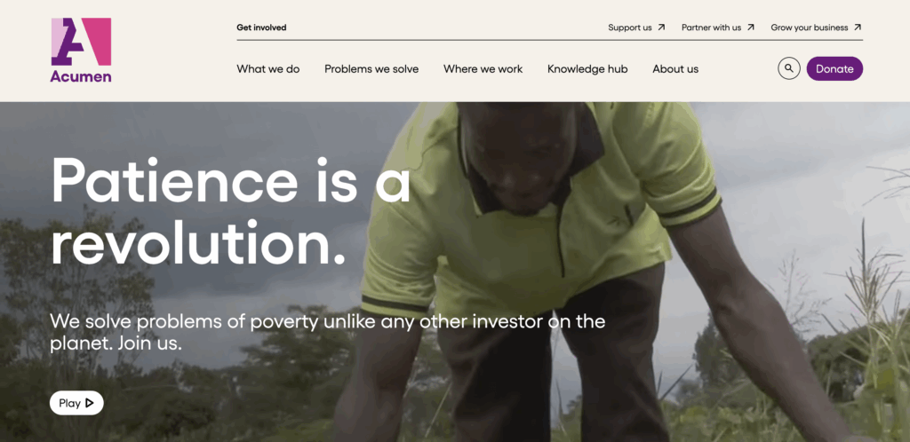
Why we love it: Acumen’s site reflects a sleek, modern brand. Their use of bold pink and gray, uniform typography and stylized icons creates a cohesive visual experience across all pages. The video loop on the main page provides an eye-catching visual hook and creates an immediate impression of Acumen as a leader and changemaker.
Looking for more examples? Check out our curated list of the best nonprofit websites for inspiration.
2. Write Captivating Copy
How you choose to articulate your mission and services will make the difference between a new visitor staying on your site to learn more or exiting after a sentence or two.
When it comes to nonprofit website best practices, writing good web copy is more than just telling a compelling story. It’s clear, concise and centered around your audience. This is where your nonprofit’s voice and tone will really shine. Ask yourself, “If my nonprofit could speak, how would it sound?”
Here are a few things to keep in mind as you write your website’s copy:
- Know your primary audience and tailor copy to them
- Use simple, everyday language
- Avoid jargon, acronyms and vague program names
- Break text into headings, subheadings and bullet points
Nonprofit Website to Inspire: The Gates Foundation

Why we love it: The Gates Foundation leads with storytelling that feels personal, emotional and urgent. Instead of mission statements packed with jargon, they open with a first-person anecdote that invites the reader into their “why.” This human-centered approach builds trust and makes the cause feel tangible and real.
3. Show Your Organization’s Impact
You likely want to shout about your amazing programs and initiatives from the rooftops — but people are more likely to support your work when they can see its real-world impact. Instead of just describing your programs, illustrate their results.
Ways to demonstrate impact:
- Share success stories with names and photos
- Post short case studies with measurable outcomes
- Use stats or infographics to show reach and results
Nonprofit Websites to Inspire: To Write Love on Her Arms (TWLOHA)
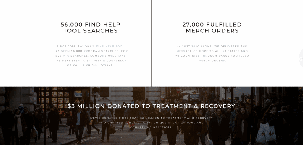
Why we love it: TWLOHA highlights their impact front and center on their homepage. By using data points and real stories, they prove their mission of how they support people in crisis.
Read More: The 50 Best Nonprofit Websites To Get You Inspired
4. Provide Clear Calls-To-Action
Your site should always lead visitors to the next step: how they can get involved and support your mission. That might be donating, becoming a member or signing up for an email list.
Whatever it is, your calls to action should be easy to find and easy to act on. Here are a few ways to promote calls-to-action, or CTAs, on your site:
- Place your primary CTA above the fold and in the navigation; it should be visible without having to scroll down the page
- Use engaging, action-oriented language like “Join Our Movement” rather than “Subscribe to Newsletter”
- Limit to one or two CTAs per page to avoid overwhelming your website visitors
- Highlight CTAs with color and spacing – don’t forget to make sure it’s accessible!
Nonprofit Websites to Inspire: Shofco
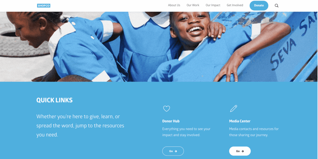
Why we love it: Shofco’s website design has a particularly clear call-to-action: donate. The donate button is easy to spot in both the navigation and footer. They also feature three clear engagement options right on the homepage.
5. Make Your Site Searchable (SEO)
When people are Googling services you provide, does your website come up? 75% of people don’t scroll past the first page of search results, so if you’re not showing up there for the terms you want to, you’re out of luck.
Search engine optimization (SEO) helps people discover your nonprofit through Google and other search engines. When done right, it increases traffic and visibility, allowing you to make a bigger impact for your mission.
Easy ways to improve SEO when building out your website:
- Create valuable, original content around your mission
- Keep content fresh by updating blogs and events
- Use relevant keywords in headers, titles and meta descriptions
- Promote your site through email, social media and events
Read More: SEO for Nonprofits in 2025: A Practical Guide to Getting Found in Google, AI Tools, and Beyond
Nonprofit Websites to Inspire: DonorsChoose

Why we love it: DonorsChoose regularly updates their content and uses clear, keyword-friendly page titles. Their search visibility brings in major organic traffic.
6. Include a Blog on Your Website
We highly recommend adding a blog to your nonprofit website – it’s a great way to drive traffic, boost your SEO and provide you with resources to share via email and social media. Plus, a blog can establish your nonprofit as a thought leader in your industry.
Think of your nonprofit’s blog as the place for you to tell powerful stories, highlight your organization’s impact and spread the word about your mission. It can also give donors an inside look at your organization, helping them feel involved, understood and up to date.
Not sure what to write about? Here are some ideas for nonprofit blog posts to get you started:
- Impact or success stories from members, volunteers or clients
- Behind-the-scenes or in-the-field stories
- Feature partner organizations
- Highlight donors and volunteers
- Share industry news and insight
- Curate new resources from others in your industry
- Summarize research reports your organization may be working on
- Q&A with your CEO and expert staff
Nonprofit Websites to Inspire: Greenpeace USA

Why we love it: Greenpeace USA’s blog is a go-to source on all things environmental. They focus on breaking news and providing insight, making them an authority in their space. The blog is active, with posts on trending topics published weekly.
7. Use Compelling Visuals and Media
Now comes the fun part: choosing media for your website! Did you know it takes a tenth of a second for the human brain to process visual information? This is 60,000 times faster than the time it takes to process text — meaning strong imagery grabs attention and communicates your mission faster than words alone.
Having a visually interesting website structure will give visitors a better user experience and, when done properly, result in higher engagement rates, a better ROI and effectively accentuate your mission.
Whether you’re using graphics, photos, videos or gifs, here are some tips for using media effectively on your nonprofit’s site:
- Use high-resolution images and videos
- Resize and compress files to maintain site speed
- Choose visuals that support your message
- Don’t overwhelm – leave plenty of white space between media and copy
- Get permission to feature real people
For more tips on what to include, visit our guide to top nonprofit website features.
Nonprofit Websites to Inspire: Rotary International
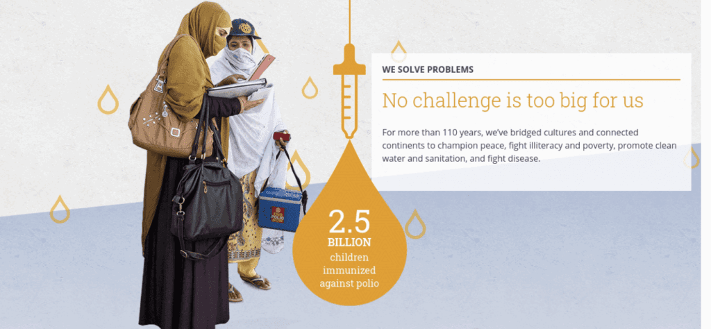
Why we love it: Rotary International’s website uses high-impact visuals throughout the site, including homepage video content and photo-rich program pages that feel immersive and engaging.
8. Create User-Friendly Navigation
Ever used a website that was so user-unfriendly you abandoned it, never to return? Even if there was useful information or content you were excited about? You don’t want that to happen to your nonprofit’s website.
Here’s a quick test you can do to see how easy your website is to use. Find someone who’s never been to your website before and ask them to sign up for a membership. Watch to see if it takes them more than three clicks.
If it does, that’s a problem. Many visitors leave a website when they can’t quickly locate the information they need. Your website structure should be easy to use and navigate, no matter where a visitor lands.
Tips for intuitive navigation:
- Use standard labels like About, Programs and Contact
- Avoid jargon and abbreviations
- Keep menus short and organized with dropdowns as needed
- Make sure each page links back to others logically
Nonprofit Websites to Inspire: Public Health Solutions
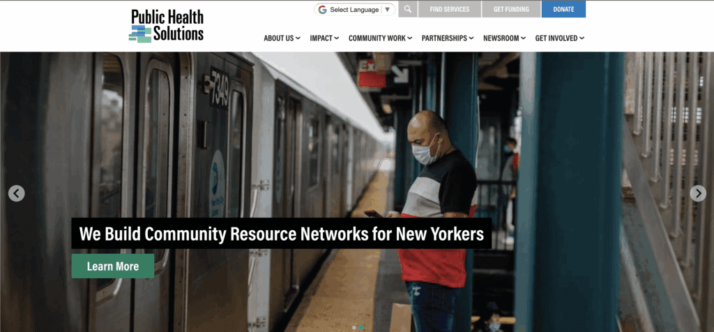
Why we love it: Despite offering a wide range of services, the Public Health Solutions menu is clean and logical, helping users find what they need quickly.
Read More: The Complete Guide to Choosing a Nonprofit CMS
9. Make Donating Online Easy
Of all your website goals, we bet increasing online donations tops the list. In today’s tech-savvy world, you can buy a new outfit straight from Instagram and book a spa vacation right on your mobile device – in virtually no time at all. Your website users will expect the donation process to be just as smooth and seamless.
A complicated donation process can discourage even your most motivated supporters. From slow-loading pages to error messages upon payment processing, there’s a lot that can go wrong if your online donation form isn’t optimized. Here are a few ways to streamline giving:
- Make your donation page easy to find. This is an important call-to-action, so make it very visible in your navigation and homepage
- Place donate buttons in the top navigation bar and homepage
- Ask for minimal required fields (“first and last name” are essential, but maybe not “job title”)
- Offer preset gift amounts and recurring options
- Keep the donation process on your site if possible; redirections can lead to distrust, slow loading times and SEO issues
Read More: 7 Steps to Create a Successful Donation Website for Your Nonprofit + 8 Great Examples
Nonprofit Websites to Inspire: charity: water
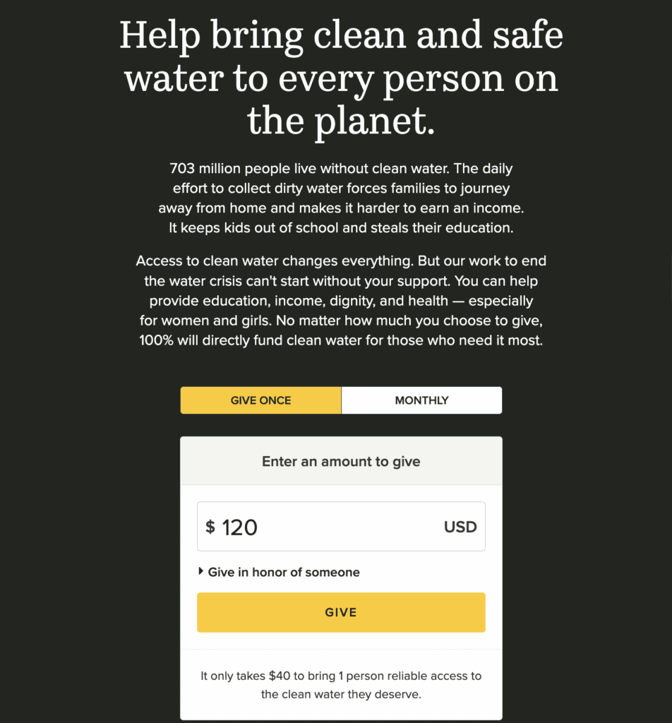
Why we love it: Giving simply does not get easier than charity: water’s donate page. The donation experience is fast, intuitive and integrated into their site. It’s easy to give without distractions or extra steps.
Read More: 12 Donation Website Templates + Examples to Inspire You
10. Simplify Your Forms
Your donation page isn’t the only place you’re collecting information from your website visitors—consider your forms for newsletter subscription, membership enrollment or event registrations. The simpler a form is to complete, the more likely people are to follow through.
No matter the type of form you have on your nonprofit’s site, follow these quick tips for designing user-friendly, but engaging forms:
- Use buttons instead of dropdowns
- Keep forms to a single column
- Minimize required fields
- Clearly show errors and confirmation messages
- Avoid filler text in the fields, which can lead to incorrect information
- Group the information you are requesting logically
- Automate a follow-up message and email confirmation to let users know their information went through
Read more: The Complete Guide to Marketing Automation for Nonprofits + Top Tools to Use
Nonprofit Websites to Inspire: Macao Design Award

Why we love it: Macao Design Award’s website structure proves that forms don’t have to be boring for their design competition. They keep it simple and straightforward, while providing an interactive experience – who said forms can’t be fun?
11. Link Internally
When it comes to website best practices, internal linking should be a priority. Internal links guide users to other relevant pages on your site, without them having to look for it—like the donation page when reading about your upcoming fundraiser or additional volunteer articles when sharing impact stories.
These internal links enhance your SEO, simplify site navigation and provide an overall better user experience for your website visitors.
Tips for optimizing your nonprofit’s internal linking:
- Use descriptive links like “explore our programs” instead of “click here”
- Make sure the link description is clear and accurate
- Link related pages like blog posts about your nonprofit’s impact to donation pages or volunteer opportunities
- Use buttons for important links, especially on mobile devices
Nonprofit Websites to Inspire: God’s Love We Deliver
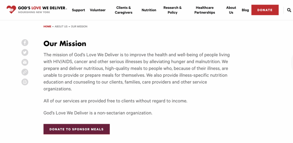
Why we love it: When browsing God’s Love We Deliver’s website, visitors are frequently directed to more resources throughout the site. Their links are clear and logical, guiding visitors through services, programs and impact stories.
12. Make Sure Your Website Is Accessible
Accessibility ensures everyone can use your site, including those with disabilities, like a visual impairment. If your site is not accessible, you’re likely turning away potential donors and partners. The user experience is a crucial part of website design and many individuals utilize tools like a screen reader. Your website structure should take this into consideration to be fully inclusive.
This inclusivity demonstrates good social responsibility, but accessible websites also tend to rank higher with search engines like Google and Bing, allowing your nonprofit to reach a wider audience.
Not quite sure what you can do to improve? Here are a few ways to optimize your website for accessibility:
- Add alt text to all images
- Include captions for videos
- Use clear, descriptive text for your links
- Avoid embedding text inside images
- Use high-contrast colors and readable fonts
The Web Accessibility Initiative (WAI) has a wealth of resources all about website accessibility standards. Check out their Accessibility Fundamentals to ensure you cover all your bases.
Nonprofit Websites to Inspire: The Cram Foundation
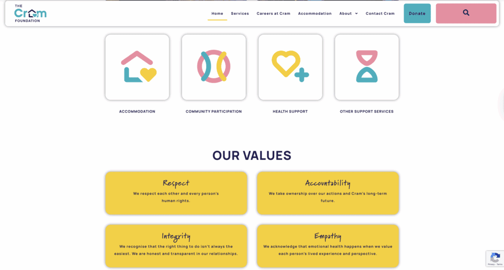
Why we love it: The Cram Foundation site features strong contrast, clear fonts and large text sizes, offering a user-friendly experience for all visitors.
13. Be Sure Your Website Is Responsive
Are people visiting your site, but not staying long? A likely culprit is that your website isn’t where your visitors are—their phones. After all, 94% of nonprofit websites are optimized for mobile use. Your website should look fantastic, no matter what device or browser visitors use.
Updating your website mobile responsiveness in mind keeps users on your site longer. Visitors will have a better user experience with an easier time accessing information and signing up for events, no matter where they are. This also allows your supporters to act in the moment – whether it’s donating, registering or sharing on socials – without forgetting while on the drive home.
Keep these tips in mind when making a mobile-friendly website design:
- Use a responsive website builder or theme
- Test pages on phones, tablets and multiple browsers
- Ensure buttons and navigation work well on smaller screens
(PS: All WildApricot’s website templates are fully responsive! If you want to try it for yourself, start a free 60-day trial today.)
Nonprofit Websites to Inspire: Aging Ahead
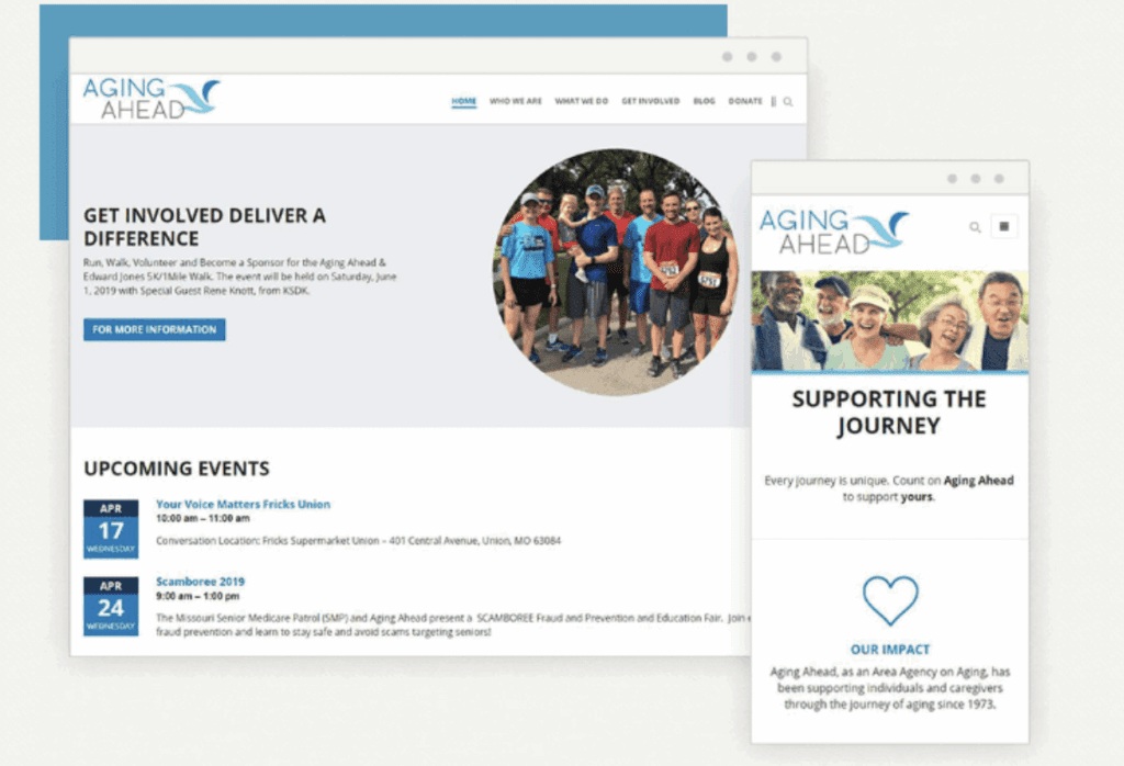
Why we love it: The design of Aging Ahead’s website looks great no matter where visitors access it—desktop, tablet or mobile—with intuitive navigation and layout across devices.
14. Include Other Ways to Connect
While your website is your most important digital platform, it’s still vital to share your other communications platforms. Here are some stats to consider:
- 87% of nonprofits regularly use social media in their digital marketing and fundraising strategy
- Social media and email are the second and third most effective fundraising and communications channels.
- 52% of nonprofits reported working with social media influencers
- Mobile messaging (SMS) subscriber lists grew 8% in 2024
Here are some easy ways to promote your alternate channels on your nonprofit’s website:
- Add social media icons and email signup to your website footer
- Create a “Get Involved” page with ways to subscribe and follow
- Link to your social channels in blog posts and newsletters
Nonprofit Websites to Inspire: Human Rights Watch

Why we love it: The Human Rights Watch homepage footer includes email signup and social media links, making it easy to stay in touch.
15. Invest in Website Security
Now more than ever, your website must be secure. This is especially true if you’re collecting donor and member information. With 27% of nonprofits worldwide experiencing a cyberattack, it’s vital to take the time to safeguard your website. This will go a long way in maintaining trust with supporters and save you headaches in the long run.
To ensure your nonprofit’s website is following the best practices of modern cybersecurity, take these actions:
- Choose a reputable web hosting provider
- Use secure payment processing tools
- Keep your CMS, plugins and themes updated
- Assign unique logins for each team member
Not sure where to start? Read our guide on crafting a nonprofit privacy policy that protects your members and your mission.
A secure, user-friendly, mobile-optimized site is your nonprofit’s most powerful digital tool. If you follow the best practices we shared today, you’ll be able to create a site that inspires visitors to take action, support your mission and keep coming back.
Check Out WildApricot’s Website Builder
Ready to get your nonprofit set up with a professional-looking website PLUS a membership database to manage all your members’ needs? WildApricot is an all-in-one membership management software, built with nonprofits like you in mind. We know that your website isn’t just a homepage – it’s the center of your community. With web-builder features like:
- Drag-and-Drop Website Editor
- Gated Members-Only Pages and Content
- Online Store and Automated Payment Processing
- Professional, Mobile Responsive Website Templates
- Event Registration Forms with Integrated Calendars
- Online Discussion Forums, Blogs and Articles
You can create the website of your nonprofit’s dreams, no coding required!

Check out all of WildApricot’s features and discover how we can help your nonprofit simplify your operations and maximize your impact. Start your journey with a free 60-day trial here!

![Best Membership Website Examples in 2026 [+ 12 Design Tips]](https://www.wildapricot.com/wp-content/uploads/2023/10/Main-Blog-Thumbnails-2026-03-17T143806.792-1024x717.png)