Countless people across the world first learn about nonprofits from their websites. That’s why having one of the best nonprofit websites is essential. After all, your website helps visitors decide if they want to donate to your cause.
As the digital face of your mission, your website needs to tell your nonprofit’s story, show your impact and provide a clear call-to-action. Whether you’re preparing to launch your nonprofit’s website or revise your current one, I’ve got your back.
I’ve found the 50 best nonprofit websites to guide you along the way. From eye-catching graphics to intuitive layouts, discover what makes these websites stand out.
And don’t worry, having a great nonprofit website doesn’t mean that you need a big budget. Although some of the websites I’ve listed here are from national nonprofits, others are local branches or small organizations that have used simple nonprofit website builders to create a click-worthy layout.
Read More: 7 Steps to Create a Donation Website for Your Nonprofit + 8 Great Examples
What Makes a Great Nonprofit Website?
Before we dive into the 50 best examples, let’s first cover what all great nonprofit websites have.
1. Clear Mission
Before making any donations, prospective supporters need to learn about your nonprofit’s mission. Start by explaining the problem that your nonprofit tackles and how your team works to solve it. This way, visitors can understand why your nonprofit is necessary, connect with your cause and feel motivated to get involved.
2. Compelling Storytelling
Storytelling is essential for creating emotional connections with your website visitors. Share the stories of those you help, like the communities without access to clean drinking water or animals in need of forever homes. Then show how your nonprofit has changed these lives for the better and how you strive to keep uplifting these communities.
3. Strong Visuals and Graphics
Visuals and graphics bring your mission to life. Your nonprofit website design should highlight your impact with images of the work you do, the community you support and your dedicated team. These images will complement your storytelling and help potential supporters relate to your cause. Be sure to use consistent imagery that matches your nonprofit’s branding for a cohesive visual design.
4. Quick Loading
Nothing frustrates website visitors quite like long load times. Website Builder Expert reveals that 40% of visitors would leave a site that takes four seconds to load. Not only is page speed important for great user experiences, but it’s also an SEO (or Search Engine Optimization) ranking factor. Test your website’s load speeds and make adjustments if needed, like optimizing images and removing unnecessary plug-ins.
5. Seamless User Experience (UX)
The best nonprofit websites have seamless UX, letting visitors easily find the information they need and take action. Make sure that your website’s navigation is straightforward and that the most important pages can be found within a few clicks. Avoid clustered layouts, outdated visuals and burying information deep within your website.
6. Mobile-Friendly
Your nonprofit’s website needs to look and work just as well on mobile devices as it does on desktops. Having a mobile-friendly website is crucial for giving smart device users great experiences. Plus, mobile optimization is another important part of your website’s SEO. Check that your website’s text, visuals, navigation and load times are mobile-friendly.
7. Accessible
Your website needs to be accessible to all visitors, such as the blind and visually impaired. There are steps you can take to make your website accessible including:
- Allowing keyboard navigation
- Using high-contrast colors
- Adding alt text to images
- Letting users enlarge font sizes
- Writing video transcripts
8. Clear Calls to Action (CTAs)
After getting visitors interested in your cause, you’ll need a clear call to action. Your CTA should tell supporters exactly how they can contribute to your mission, like making financial donations or volunteering. Be specific about why your nonprofit needs this support and what you’ll achieve with the help of donors. Sharing success stories and impact stories of what your nonprofit has done will help you achieve this as well.
9. Streamlined Donation Page
Once visitors click on your CTA, they should be taken to a streamlined donation page. This page shouldn’t have any unnecessary content that can distract donors. Keep this page concise with only the most important information, like explaining how contributions will be used and directing people to the donation form.
10. Social Media Links
Complete your website with links to your nonprofit’s social media. Seeing your social media pages can reinforce your nonprofit’s authenticity to potential donors. Also, your social media is a great way to illustrate your mission and achievements while expanding your digital community.
Learn More Essential Practices for Nonprofit Websites:
- 3 Ways to Effectively Brand Your Nonprofit’s Website
- 15 Nonprofit Website Best Practices You Need to Know
50 of The Best Nonprofit Websites
With our 10 recommendations for nonprofit websites in mind, let’s explore our picks for the 50 best nonprofit websites.
1. Invisible Children
Invisible Children packs a lot of information into an easy-to-understand format. Visitors can explore the nonprofit’s homepage to see different aspects of their work, like their peace committee development. Also, their donation button follows potential supporters on the right as they scroll for frictionless donations.

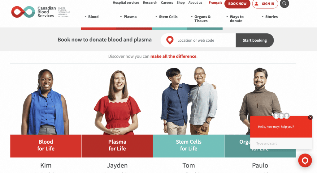
2. Canadian Blood Services
Canadian Blood Services prioritizes the information most people will be looking for: How to donate blood and plasma. Visitors can watch a video to learn more about the nonprofit, but if they just want to find a place to donate, they can immediately enter their location and get started. This is a great example of UX because donors don’t need to go hunting for the information they want.
3. charity:water
It seems like charity: water appears on every “good example” list, and that’s because their online work is outstanding! Their homepage is focused on the impact donors have, explains their mission and immediately offers more ways to get involved. They also have a compelling design with impactful images and tell a positive story about how they’re working to change the world.

4. Leukemia and Lymphoma Society
The Leukemia and Lymphoma Society’s take a storytelling approach by featuring survivors’ narratives. They also offer different menus for specific audiences such as healthcare professionals and patients. This layout works because cancer researchers and doctors need different information than people with cancer and their families do.

5. National Wildlife Foundation
If you want to see the difference that stunning visuals can make, visit the National Wildlife Foundation’s website. They use photographs and illustrations to call attention to their mission while showcasing the animals and landscapes they seek to protect. The nonprofit also uses a simple dropdown navigation menu to organize a ton of information.

6. Heifer International
Heifer International’s website is all about creating impact. Their website’s clear layout prioritizes how making a gift creates positive change. In just a few words, the nonprofit explains their mission to end poverty, shares stories of the people they support and shows how people can contribute to their cause with online donations by filling out their donation form.

7. Illinois Digital Educators Alliance
Illinois Digital Educators Alliance’s website uses a strategically contrasting color scheme to make information easy to find. Their menu titles are simple, but descriptive, such as their “Learn with Us” dropdown which covers various upcoming events.

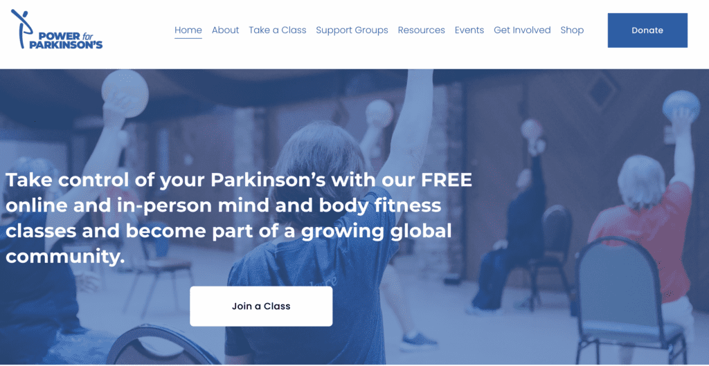
8. Power for Parkinson’s
If you’re thinking, “Of course giant organizations have great websites, they have giant budgets!”, don’t give up. Nonprofits with tighter budgets can create effective websites.
Just take a look at Power for Parkinson’s. They have a simple homepage that clearly demonstrates their mission and links to their exercise programs. The nonprofit even includes on-demand workouts for people who can’t come to their classes.
“I love how they feature their workout videos on a section of the site, since this is so central to their mission and helping those with Parkinson’s manage their symptoms,” says Stacy Caprio, founder of Growth Marketing.
9. Campus Bound Scholars
To inspire people to donate, nonprofits need to build a strong case for support. Campus Bound Scholars does a great job of this by starting with their mission, and as you scroll they dive into the problem they’re tackling and what they’re doing to address it. This context immediately establishes their need for support and encourages visitors to donate towards their cause.
Ciara Hautau, a lead digital marketing strategist who worked on the website, advises: “I think the best practice for designing a nonprofit website is making it clean, easy to navigate and resourceful. You want users who visit the site to know right away what the mission and purpose are of the nonprofit and provide resources on how they can help or how your organization can help them.”


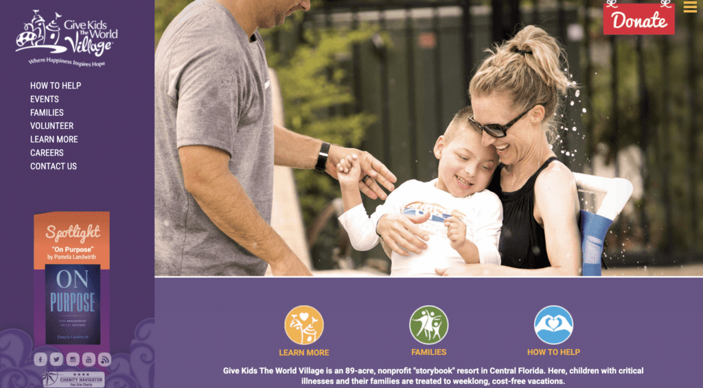
10. Give Kids the World Village
Give Kids the World Village uses engaging photos, a simple layout and a cheerful tone to show their commitment to providing joyful moments for sick children. Visitors can scroll down the homepage or use the sidebar menu to get around their easy-to-navigate site. To make contributing seamless, their distinctive donate button follows visitors as they explore the website.
“Additionally, their fundraisers and their correspondence are fabulous!” said Dawn Veslka, co-founder of Cards2Warriors.
11. Warrior Rising
A major goal of any nonprofit website is to motivate visitors to take action. Whether it’s signing up for emails, watching a video or making a donation, you should always provide visitors with the next step. Just take a look at how Warrior Rising features several calls to action on their site.
Elena Ludlow, who led the design at Red Olive, explains, “When the Warrior Rising homepage loads, there are five calls to actions immediately visible: one in the main navigation, one on the side of the page and three at the bottom.
Three of these are for our primary goal of donations, with the other two being for sub-goals of the site. You don’t want to overwhelm a site visitor with too many calls to actions as it can seem scam-y or disingenuous and can hurt their trust. However, make sure the calls to actions are in visually prominent places.
Our header and sidebar calls to action follow a visitor as they scroll down, both serving as a continuous reminder and making it easy for them to donate when they are ready.”


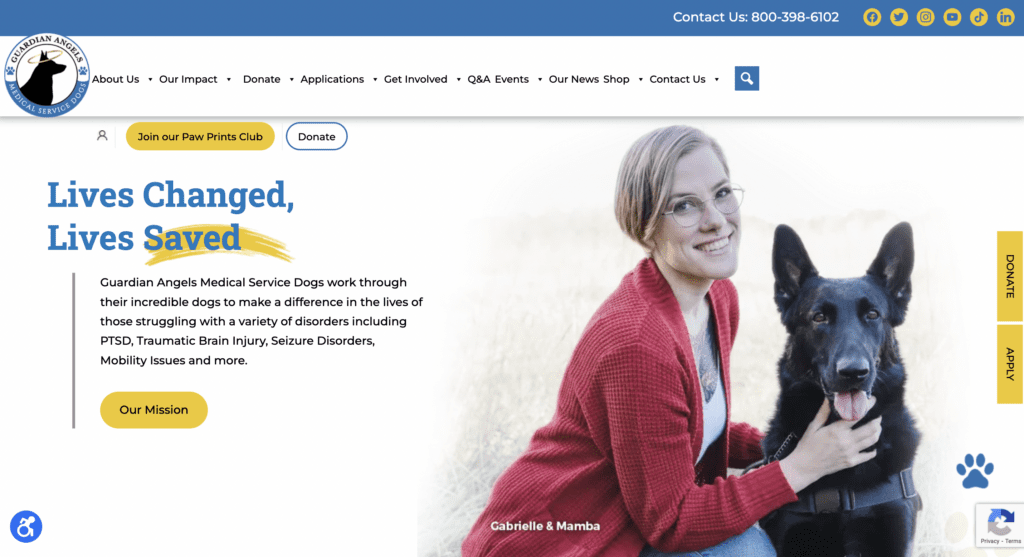
12. Guardian Angels Medical Service Dogs
Guardian Angels Medical Service Dogs use (adorable) images of dogs to bring attention to different calls-to-action. To illustrate their impact, they feature the stories of people helped by their service dogs. This combination of heartwarming images and stories of transformed lives makes the nonprofit’s mission clear and relatable.
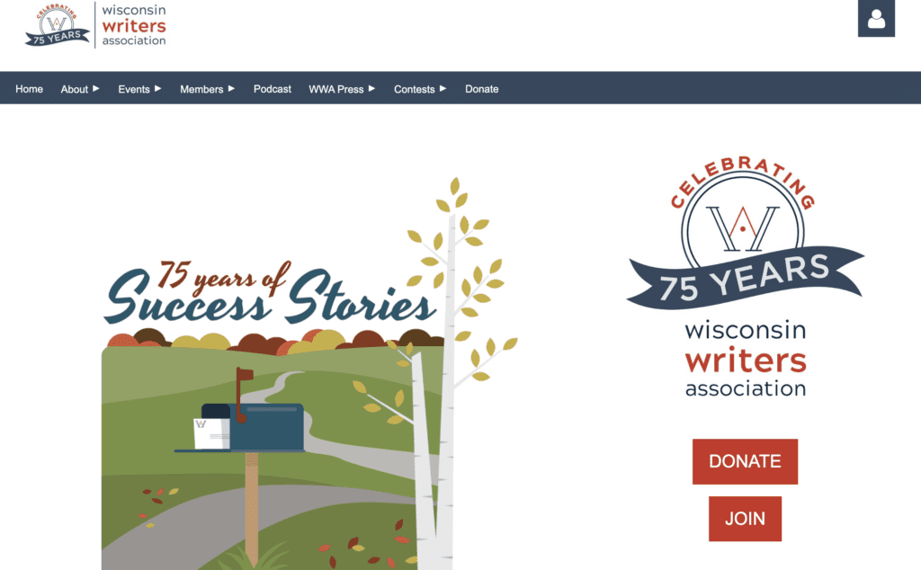
13. Wisconsin Writers Association
The Wisconsin Writers Association’s website is simple and clean. Thanks to the bright boxes in the middle of the homepage, the nonprofit’s initiatives are easy to spot. This concise layout is perfect for letting visitors easily find what they’re most interested in, like memberships or local writing groups.
14. Veterans Legal Institute
If your website needs to appeal to more than one audience, take some inspiration from the Veterans Legal Institute. Their homepage provides visitors with the option to either “Get Involved” or “Apply Now.” This way, visitors can quickly access the information that’s most relevant to them.
Deputy Executive Director KellyAnn Romanich advises, “Be clear on sections that are for clients and those who wish to support as donors and volunteers.”

15. Motley Zoo Animal Rescue
The Motley Zoo Animal Rescue uses a down-to-earth tone to explain their mission and how their adoption process works. Since this nonprofit has plenty of information to share, they organize their topics with a dropdown menu. This dropdown menu lets potential supporters go to the pages relevant to their journey like adopting an animal and learning other ways to get involved.


16. Literacy Partners
Literacy Partners uses a simple, but effective format to show their impact. By scrolling down the homepage, the nonprofit’s key information is organized into boxes, such as their approach, classes and ways people can donate. The images used throughout the website are down-to-earth and authentic, encouraging visitors to support their literacy and language programs for local communities.


Read More: The 22 Features Every Top Nonprofit Website Has
17. Toronto General & Western Hospital Foundation
By focusing on how people are impacted by health conditions or conducting medical research, the Toronto General & Western Hospital Foundation makes learning more about their cause engaging. Their imagery is extremely powerful, making the connection between their mission and saving lives. This inspires more supporters to click the donation button prominently featured at the top of every page.

18. Georgia Arborist Association
The Georgia Arborist Association’s website is firmly rooted in their tree theme through the colors and images they use. Their members’ only resources are a valuable way to attract potential members who want exclusive content. With private presentations, blogs and reutilization projects, tree care professionals and enthusiasts will feel motivated to become members.

19. Island Health
Since they offer so many services, people have many reasons to visit Island Health’s website. That means having clear navigation is a must. Visitors can easily find relevant information such as the nonprofit’s services, how to prepare for a visit and their locations which offer different treatments.

20. Anova
Anova has to appeal to two distinct audiences, people who need their services and donors. To address these audiences, there are two clear buttons at the top of every page: donate and get help now. These prominent buttons let visitors immediately access the pages they need the most. Their current event is also shown prominently on the home page to allow visitors to get more information on their fundraising efforts.

21. Tourism Saskatoon
Tourism Saskatoon makes great use of video as a storytelling mechanism. On their homepage, you’re greeted with a video highlighting all parts of Saskatoon. As visitors scroll down Tourism Saskatoon’s homepage, they’ll see bright and inviting images of the area. These visuals tie into their hashtag #saskatooning which encourages people to explore their social media page to discover more food, art and culture. Together, the images and hashtag make planning trips to Saskatoon exciting.

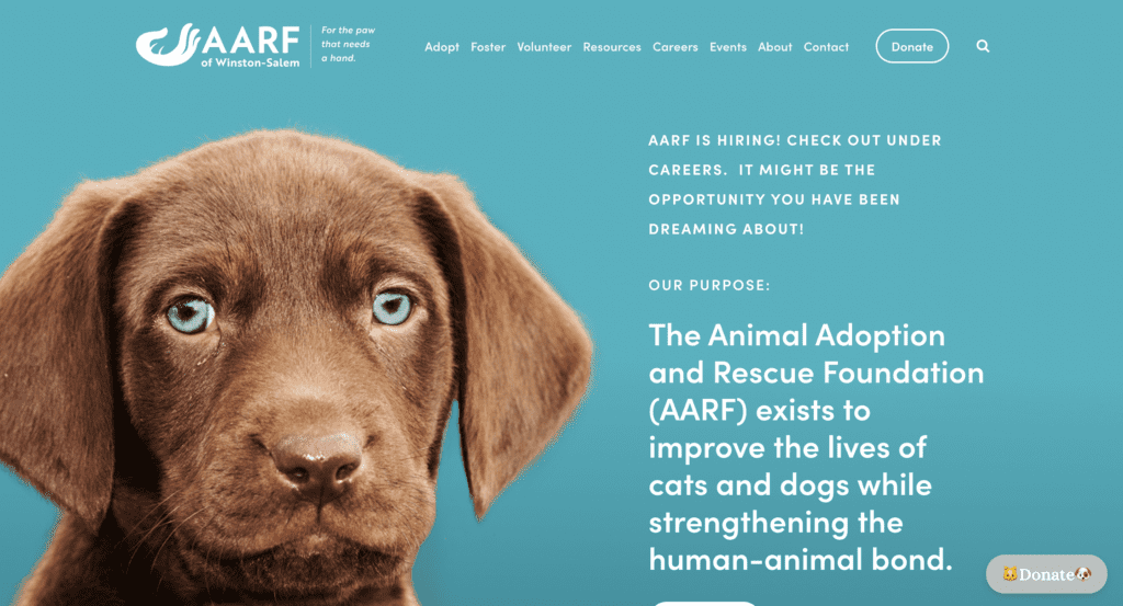
22. The Animal Adoption and Rescue Foundation (AARF)
The color palette and imagery that the Animal Adoption and Rescue Foundation uses is modern and clean, bringing the focus to the animals they seek to help. As the user scrolls down the home page, they see a featured pets section with large, high quality images of adoptable pets. The AARF keeps their website simple, clean and cohesive.
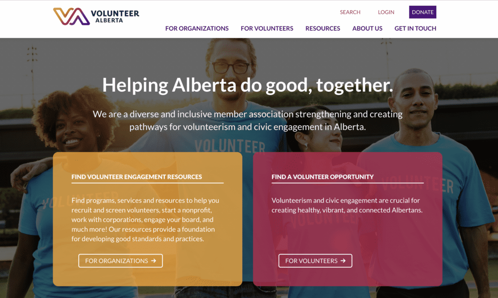
23. Volunteer Alberta
Volunteer Alberta serves as a one-stop shop for nonprofits and volunteers. To strengthen volunteerism and civic engagement in Alberta, they use a clean layout to avoid information overload. The homepage has two distinct sections: finding volunteer engagement resources and finding volunteer opportunities. This design is great for efficiently directing visitors to relevant information and services.
24. CNIB Foundation
Are you concerned about making your website accessible? Check out CNIB Foundation’s website for a great accessibility example. Viewers can adjust the website’s visuals to accommodate their needs by clicking “show preferences” at the top of the page. People can change the font size, contrast and more. These settings will stay in place as potential donors navigate the website and return for future visits.


25. Telus World of Science
Telus World of Science Edmonton has an engaging website full of interesting resources for science lovers. But on the days when you just want to quickly find out when the museum is open and how you can get there, the nonprofit ensures that this information is easy to find. With visitor information and their phone number displayed at the top of every page, planning museum trips is a breeze.

26. Edmonton Public Library
Here’s another Edmonton nonprofit prioritizing the information that visitors need the most, the Edmonton Public Library! Their organized dropdown navigation lets book lovers and their local community find everything from staff literary picks to upcoming events and services for people of all ages.

27. The Friends of the Tasmanian Museum and Art Gallery
The Friends of the Tasmanian Museum and Art Gallery’s website keeps things simple. Without too many graphics, the website can load faster. When speedy load times correlate to happier visitors, people are more likely to explore a website and learn more about their work.

28. Hal-Con
Your website introduces people to your nonprofit, so it should sound like you. Just look at the big dose of personality that Hal-Con delivers. They proudly lean into their nerdy identity by calling themselves “the biggest, geekiest sci-fi convention in Atlantic Canada,” run by “much-too-dedicated volunteers.”

29. Feed Nova Scotia
By breaking down the work you do and highlighting a specific fundraising campaign right on your homepage, potential supporters can understand your mission and want to donate. Using an easy to read font, Feed Nova Scotia illustrates their efforts by detailing the percentage of Nova Scotians under 18 that are food insecure, why they need your help and a clear appeal for donations.

30. C2 Centre for Craft
The C2 Centre for Craft organizes their website into six categories and then uses a simple three-column layout to showcase their contact information, events and exhibitions. It’s easy for viewers to go deeper, but the homepage answers what are likely the most common questions, such as, “What’s in the gallery right now?” or “When is the craft market?”

31. Inuit Tapiriit Kanatami
Inuit Tapiriit Kanatami manages several projects that celebrate their heritage and educate visitors about their culture. The nonprofit’s homepage introduces their mission of protecting the rights of Inuits in Canada. Also, their menu directs visitors to important information about the nonprofit’s work and how supporters can help strengthen Inuit communities.

32. Leadership Fairfax
The Leadership Fairfax homepage leverages social proof by using images of their community to show their impact. As you scroll down their site, they share quotes that demonstrate members’ success thanks to the nonprofit’s program and exclusive resources. The nonprofit’s usage of social proof and successful students makes it easy to see why their graduates become recognized for their leadership skills.

33. Brooklyn Waldorf School
For nonprofit schools, their website is a great way to organize information for current families and prospective ones. The Brooklyn Waldorf School achieves this with a clean layout that never makes the academic information on the page feel overwhelming.

34. Central Park Conservancy
The Central Park Conservancy is a strong example of how nonprofits can use marketing tools, like lead magnets and pop-up CTAs, to encourage donations. Their website features beautiful images of the iconic park, upcoming events and ways people can help the park thrive.

35. Ovarian Cancer Alliance of Oregon & Southwest Washington
The Ovarian Cancer Alliance’s homepage immediately shows how to reach the nonprofit through phone or email. This is an effective way to ensure that visitors feel supported. Also, their donation and subscription buttons at the top of every page make supporting their work and staying updated simple.

36. Treehouse for Kids
Treehouse for Kids features stories on their homepage that introduce potential supporters to the children they’re helping. This lets visitors see the nonprofit’s impact in real life, inspiring them to donate and help countless more children in foster care.

37. The Museum of History and Industry (MOHAI)
MOHAI puts visitors first by tailoring information to show that day’s exhibits and events. The date for this interactive element can be easily changed, making planning trips to the museum with the help of their website convenient and personalized.

Read More: How to Make Your Nonprofit’s About Us Page Awesome
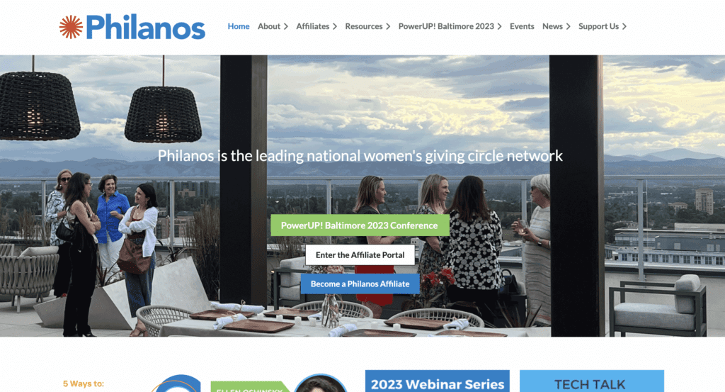
38. Philanos
Philanos’s neatly organized homepage makes their mission and services clear, enticing potential members and donors to get involved. The website’s navigation is also intuitive, with arrows in the menu to indicate that there are additional dropdown options.
39. One Table
One Table lets visitors cut right to the chase and find a gathering near them with a streamlined form. Visitors can also use the navigation menu to access guides, sign up for their newsletter or learn more about One Table’s mission. The beautiful photos of delicious food used across their website doesn’t hurt either!

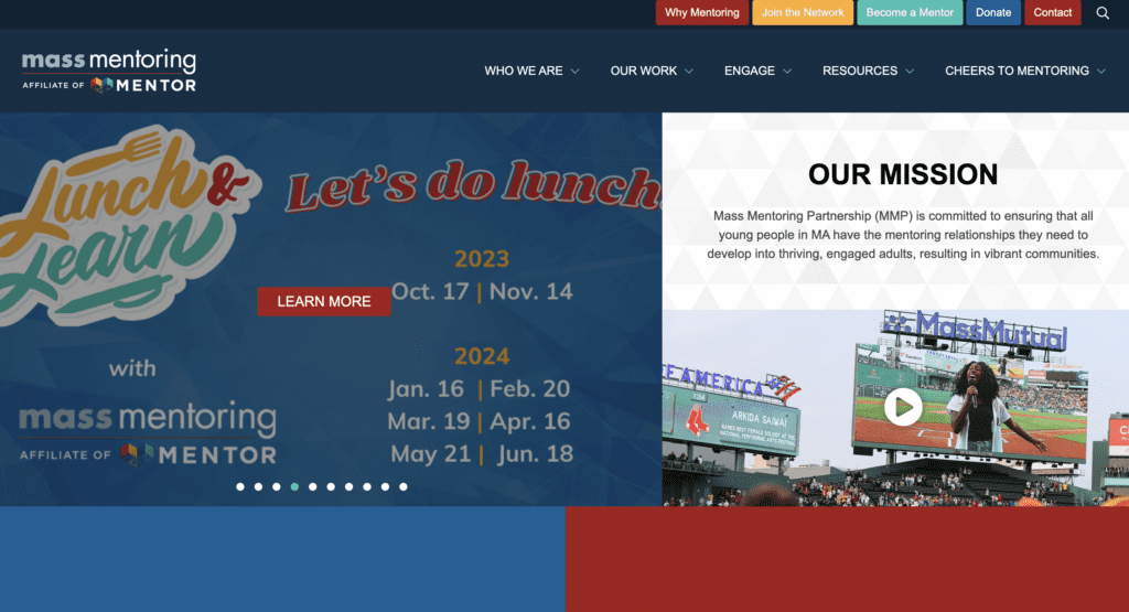
40. Mass Mentoring
The middle of Mass Mentoring’s homepage features four colorful squares that segment their programs and resources, such as advocacy and events. This layout helps visitors quickly find relevant information while upholding the nonprofit’s established color palette for a cohesive experience.
41. Sepsis Alliance
Sepsis Alliance is another great example of a nonprofit that knows how to appeal to diverse audiences. Since patients, providers and supporters all have unique needs, every visitor can easily find relevant resources. Also, every page features a donation button that follows potential supporters as they scroll.

42. GROW North Texas
By prominently including their logo in their homage, GROW North Texas can resonate with people who have seen their marketing materials elsewhere in the world. The continuity between the nonprofit’s gardening themed logo and the images they use are cohesive in theme and color, making it clear that they’re all about fresh and sustainable food.

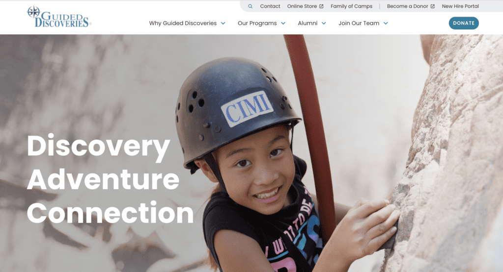
43. Guided Discoveries
Since Guided Discoveries supports children in many ways, the nonprofit has plenty of information to cover. To prevent an information overload, the nonprofit segments their homepage. The first half of this page explains their mission and values. Then the second half of the homepage shows the nonprofit’s programs and their impact like 55,000 children served annually.
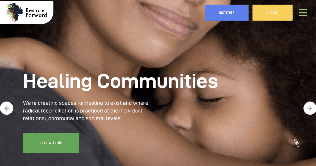
44. Restore Forward
To promote visitors’ well-being, Restore Forward provides several district programs. The top half of the homepage is dedicated to their holistic health and fresh food initiative, Seeding Health. Lower on the homepage are the nonprofit’s Reconciliation Center for repairing harm and the Black Women’s Blueprint which serves as a sanctuary. The website’s images and clean layout guide visitors to the program that meets their needs.
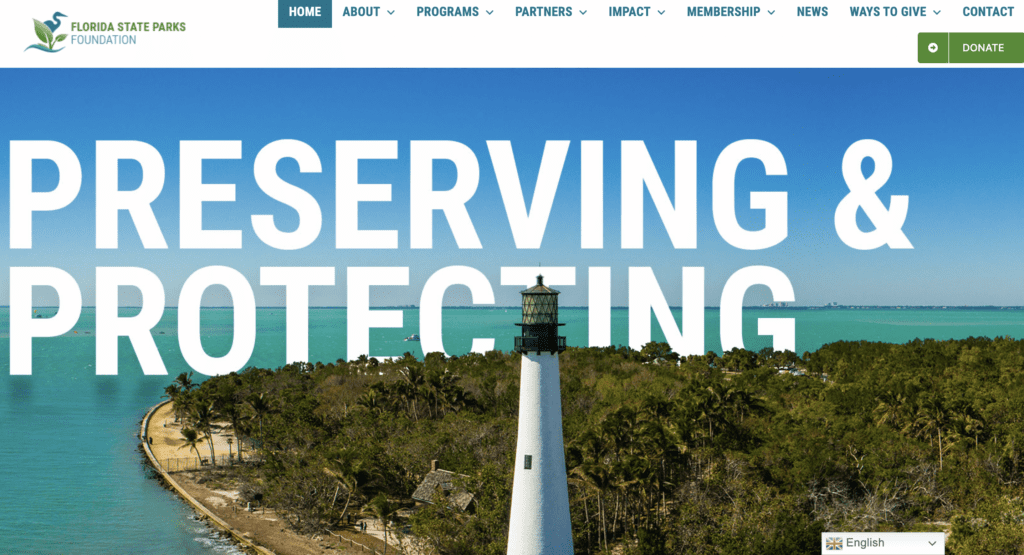
45. Florida State Parks Foundation
The Florida State Parks Foundation homepage puts their mission front and center, letting potential donors see the nonprofit’s commitment to preserving Florida’s state parks. This section is immediately followed with numbers showcasing the results of their work, like acres managed and total economic impact. To make supporting the nonprofit frictionless, the donation button follows visitors as they move around the website.
46. World Bicycle Relief
The World Bicycle Relief leans into storytelling throughout their website. They feature videos, stories and quotes from people whose lives have been changed by a bicycle. To demonstrate how necessary their nonprofit is, World Bicycle Relief shows potential supporters the issues rural communities face and how these challenges can be alleviated with bicycles.

47. To Write Love On Her Arms (TWLOHA)
TWLOHA is dedicated to providing resources for people struggling with their mental health. The nonprofit offers self-soothing tools that visitors can immediately access as well as how to find help and see upcoming events. For donors, the nonprofit provides several ways to offer support like setting up recurring financial gifts, creating memorial campaigns and donating stock.

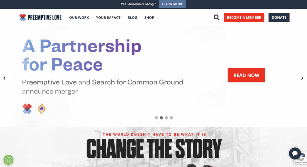
48. Preemptive Love
Preemptive Love’s homepage features rotating banner images that link to the nonprofit’s important initiatives. They also effectively use storytelling by including videos of specific people whose lives have been transformed by the nonprofit. Visitors can support Preemptive Love by either becoming a member or donating, letting them choose a contribution method that best suits them.
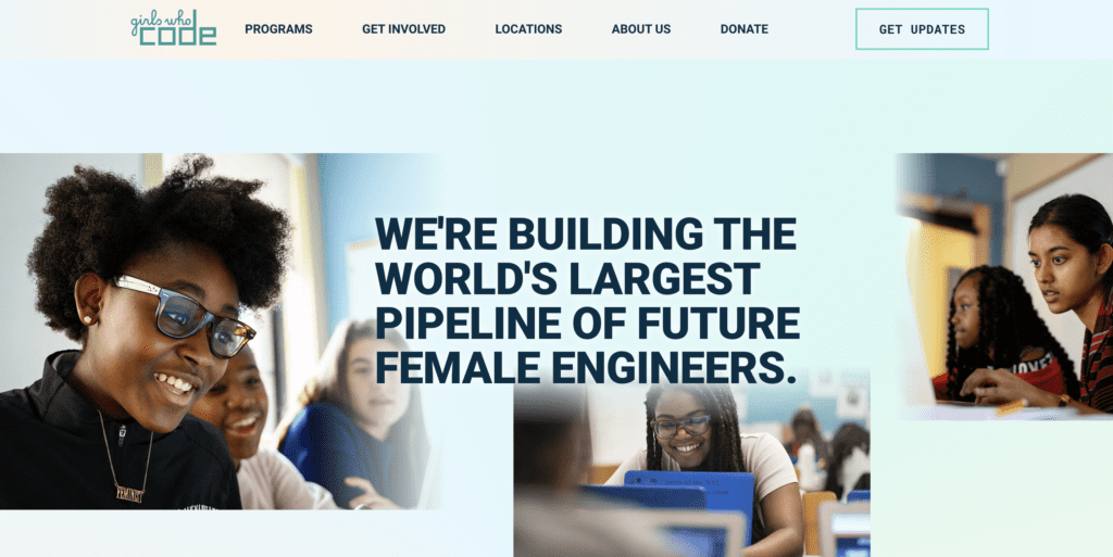
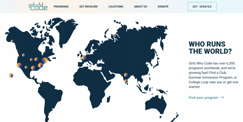
49. Girls Who Code
This nonprofit’s homepage helps girls and their families find programs where they can learn how to code. Visitors can explore the nonprofit’s programs like clubs for grade and high school students. A large map lets prospective students find a program near them and an interactive game demonstrates how fun coding can be, inspiring future generations of coders.
50. The Boys and Girls Club of America
The Boys and Girls Club of America has an extremely user friendly design. With their drop down section you can identify who you are for a tailored experience with the right resources. This innovative approach allows you to quickly access the information you need without doing a deep dive on their website.

Do you know of any other nonprofit websites you think are noteworthy? Comment below and let me know which ones I missed!
And if you’re looking for a new website builder, you can start a free trial of WildApricot today.
Check Out Our Guides For Running Membership Websites:
- The Ultimate Guide to Brainstorming Membership Website Ideas
- Nonprofit Databases 101: How To Organize Your Supporter Relationships
Inspired by Excellence: Key Insights from the Best Nonprofit Websites
After our roundup of amazing websites, are you ready to launch or revamp your nonprofit’s website? By following our best practices and taking inspiration from these great nonprofits, you can craft a website that encapsulates your mission and motivates visitors to get involved.
Like I mentioned earlier, you don’t need a big budget to make an impactful nonprofit website. With an intuitive website builder like WildApricot’s, you can create a professionally designed and mobile-friendly website for your nonprofit. Plus, features like member databases, payment tools and email databases let you manage your nonprofit and supporters all in one place.
If you’re looking for a full list of great nonprofit website builders, we’ve got you covered! Here are 17 of the Best Nonprofit Website Builders To Compare and Choose From.
Start your free trial of WildApricot today and see how it can help you amplify your nonprofit’s digital presence.
Explore Our Curated Software Guides
- Your Ultimate Guide to Membership Management Software For Nonprofits
- 8 Awesome Directory Website Builders in 2024
- The Complete Guide to Choosing a Nonprofit CMS


![Best Membership Website Examples in 2026 [+ 12 Design Tips]](https://www.wildapricot.com/wp-content/uploads/2023/10/Main-Blog-Thumbnails-2026-03-17T143806.792-1024x717.png)