Are you looking to create a website for your organization where you can easily collect online donations? Or maybe you already have one but it’s in dire need of an update?
You’ve come to the right place.
WildApricot’s website builder is used by over 20,000 organizations. It’s easy to set up and customize to your needs. More importantly, it’s part of an all-in-one solution for nonprofits and membership based organizations, meaning your website will integrate seamlessly with your membership management software. With just a few clicks, you’ll be able to use your website to:
- Register new members online and process payments
- Set up a donation page and take online donations
- Share a calendar of events and complete event registrations
- Create member-only pages
- Create a member directory
- And much more
As a nonprofit, a big focus of your operations is likely fundraising and reaching new potential donors, so your website should be equipped with a functional donation page.
In this post, we’ll look at 12 website templates (or themes, as we refer to them) offered by WildApricot that make it easy to collect donations online, as well as examples of real organizations who use them.
These themes are extremely easy to use and customize. They are also responsive, so they’ll work and look great on any device (desktop, tablet, mobile, etc).
Each WildApricot theme uses a drag-and-drop system so you can personalize them as much as you’d like. You can select content gadgets as building blocks to add text, pictures, tables, and links wherever you want on your page. You can use our other gadgets to display dynamic content from your WildApricot account, like recent blog posts or upcoming events.
To track your fundraising efforts, you can add a donation goal to a page on your site. The donation goal gadget displays a progress bar that measures progress towards your financial goal.
WildApricot themes are designed to be flexible, so you can play around with spacing between the content blocks and change colors and fonts without any knowledge of HTML or CSS (though if you’re comfortable with it, you can also edit the existing code to customize your site even further).
For a full guide on how to create a great donation website, be sure to read this post.
Now, without further ado, let’s take a look at the WildApricot donation website templates:
1. Casefile
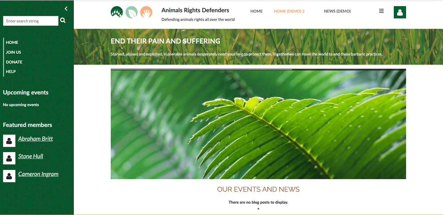
Casefile uses toned down colors and simple fonts to present visitors with all the information they need right from the home page. From there, they can click on links to check out other pages of the site.
The simple, straightforward design makes it ideal for advocacy organizations or associations representing lawyers and jurists. A stand out feature of this theme is the collapsible sidebar, which makes it easy to navigate to an important section of the website at any point.
Who uses it well:
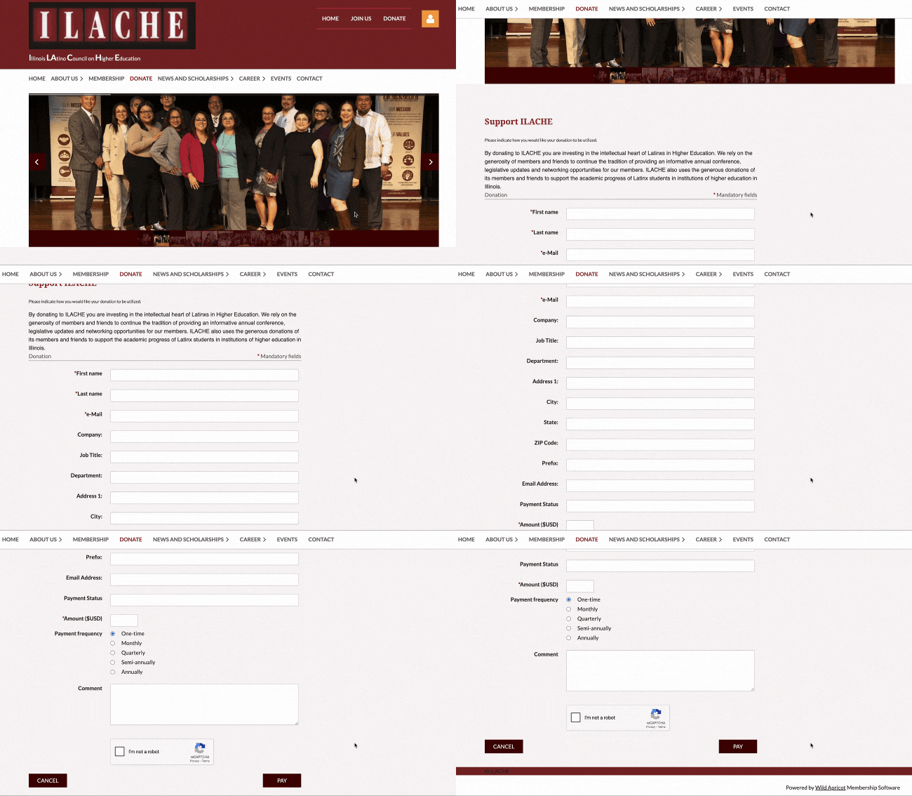
For an example of the Casefile theme in use, check out this website from the Illinois LAtino Council on Higher Education.
They’ve used the sidebar to keep visitors informed of upcoming events and to display a social media widget, which automatically updates with their latest posts.
Their donation page is clean, simple and matches the color scheme of the rest of the site. They start with a carousel of photos, displaying their mission in action. Just before the donation form, they include a block of text to explain why donor support is so important to their organization. The form itself is easy to read, quick to fill out and includes all the mandatory fields.
2. Kaleidoscope
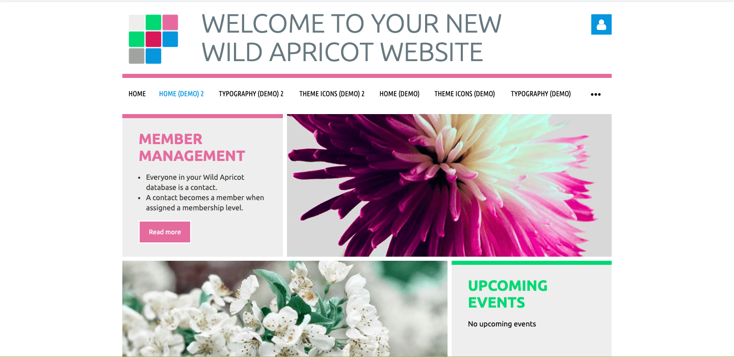
Kaleidoscope uses bright colors and large blocks of photos and text to draw the visitors’ attention to the most important information on the site. It’s especially great for organizations who display a lot of photos or imagery as part of their brand.
Who uses it well:
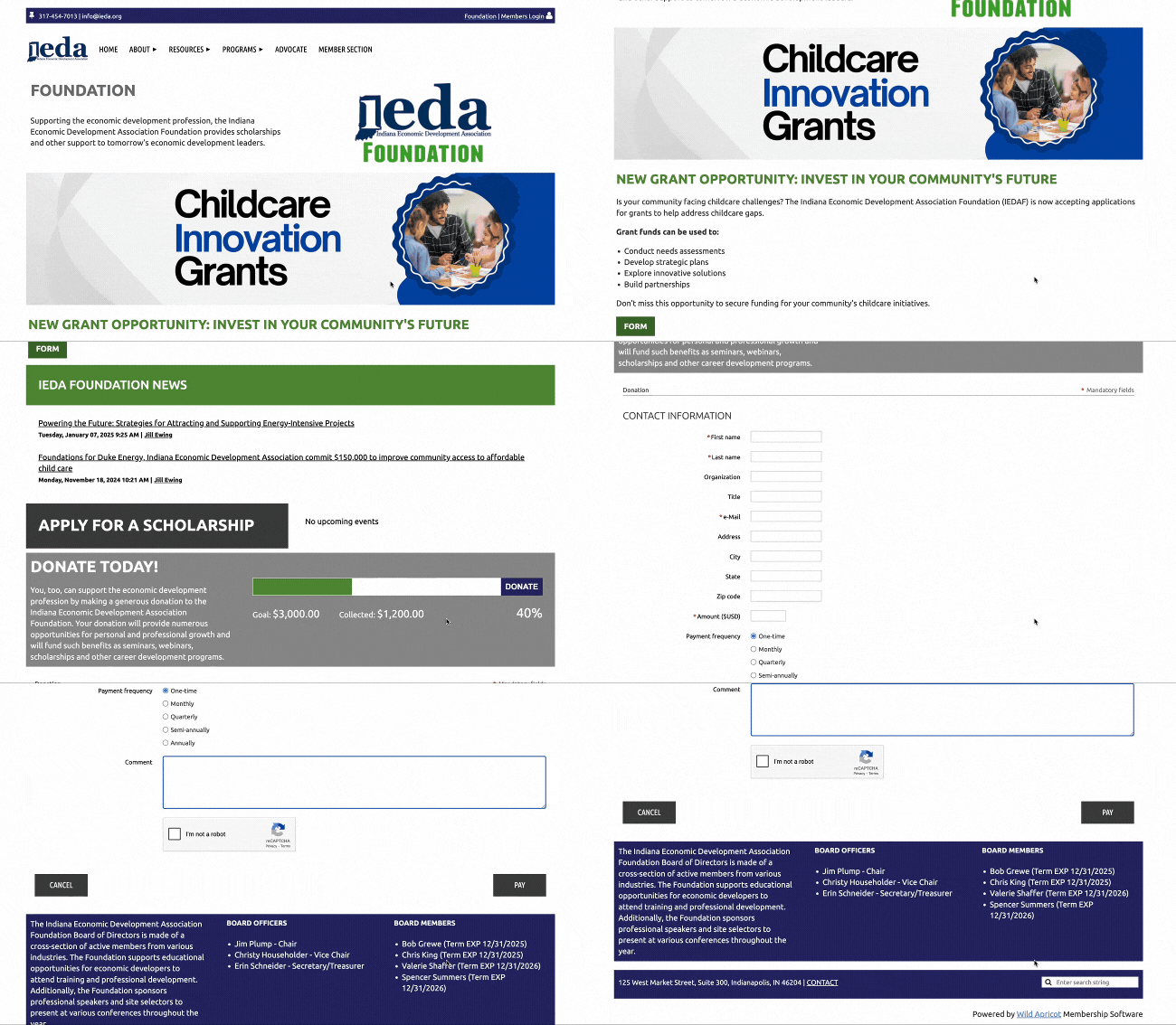
One organization that uses this theme well is The Indiana Economic Development Association.
Their home page displays visually appealing photos and colorful blocks, containing the most information about their organization.
Near the bottom of the home page is a widget that tracks how much money has been raised so far towards their fundraising goal — a similar widget is present at the top of their donation page.
The donation page explains the importance of donations and what the funds will be used for. The donation form is visually appealing and easy to use.
3. Building Blocks
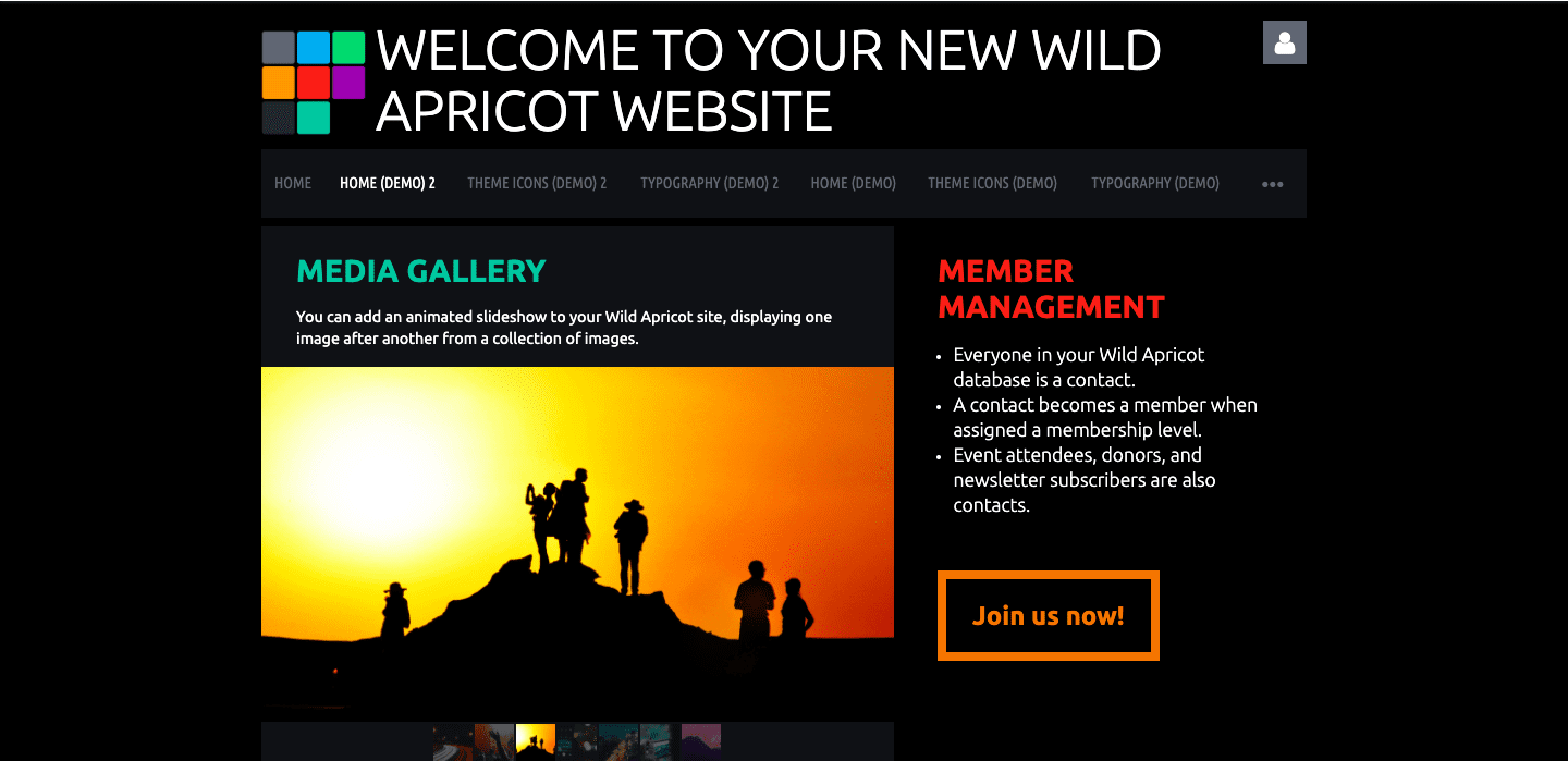
Building Blocks is a theme similar to Kaleidoscope, but it uses a darker color pallet, a black background and white text. It’s perfect for organizations who want their website to stand out or whose branding fits well with the dark color scheme.
Who uses it well:
A great example of an organization that uses this theme is The Basin Music Festival Association, who is focused on establishing The Basin (and the foothills region) as a valuable destination for live-music, recreation and culture; while promoting community and local musicians.
Their donation page features a collage of colorful photos of performers, which fits perfectly with the black background and white text used in this theme. Their website is minimal, simple to use, and makes it quick and easy for visitors to donate or join as a member.

4. Tinted Tiles
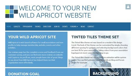
Tinted Tiles is a monochromatic theme, relying on various shades of a single color, rather than different colors. It uses white or gray text, making for a cohesive and clean looking website where no single element stands out too much.
It’s perfect for organizations who aren’t planning to use a lot of photos or imagery and want a minimal, clean look to their website. The color scheme can easily be customized — using shades of the main color in your organization’s logo typically works well.
Who uses it well:
A great example of the Tinted Tiles theme in use is the Episcopal Communicators website. The blue color scheme fits well with their logo, which stays present in the header across every page on the site. They make use of blue color blocks on the home page, but keep the rest of the pages more minimal by only using shades of blue in some of the headings.
Their donation page is minimal, as well. They quickly explain the scholarship they raise funds for and provide a simple donation form.

5. Showcase
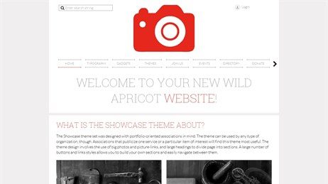
Showcase is designed to display large photos and picture links, as well as large headings that divide the page into sections. It’s perfect for organizations who have portfolio-style content and focus on presenting one particular service or item of interest.
This theme also has a special menu. Sliding navigation and clear design make it easy for users to navigate the site and find the pages they’re looking for.
Who uses it well:
The Japan Society of New Orleans uses this theme for their website. Their menu bar contains many different items, but they’re easy to scroll through and navigate. Their donation page is simple and fits the color scheme of their logo, the menu bar and the footer. It starts with a clear thank you message, before displaying a clean, easy-to-use donation form.

6. Terra
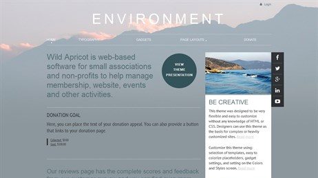
The Terra theme offers all the same content blocks you can utilize in other themes, while overlaying the main block of your website on top of a beautiful background image.
This image is completely customizable (or can even be left blank if you choose) and moves together with the rest of the site as users scroll through.
Who uses it well:
For an example of the Terra theme in use, check out the The Kolapore Wilderness Trails Association’s website.
They display a photo of one of their trails as the background image — to site visitors, this can serve as a constant reminder of their mission. This image stays consistent across every page on the site.
Their donation page clearly outlines why donations are important, as well as the three ways to make a donation.

7. Firma
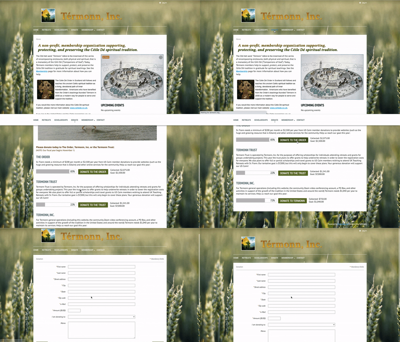
Firma is a theme very similar to Terra in that it also features a background image. However, unlike with Terra, the image stays in place and doesn’t move with the rest of the website as site visitors scroll up and down.
You can upload your own background image or choose from a dozen versions of the template, all complete with beautiful images and matching color schemes.
You can also choose to play around with the opacity of your content blocks so that more of the background image is visible underneath.
Who uses it well:
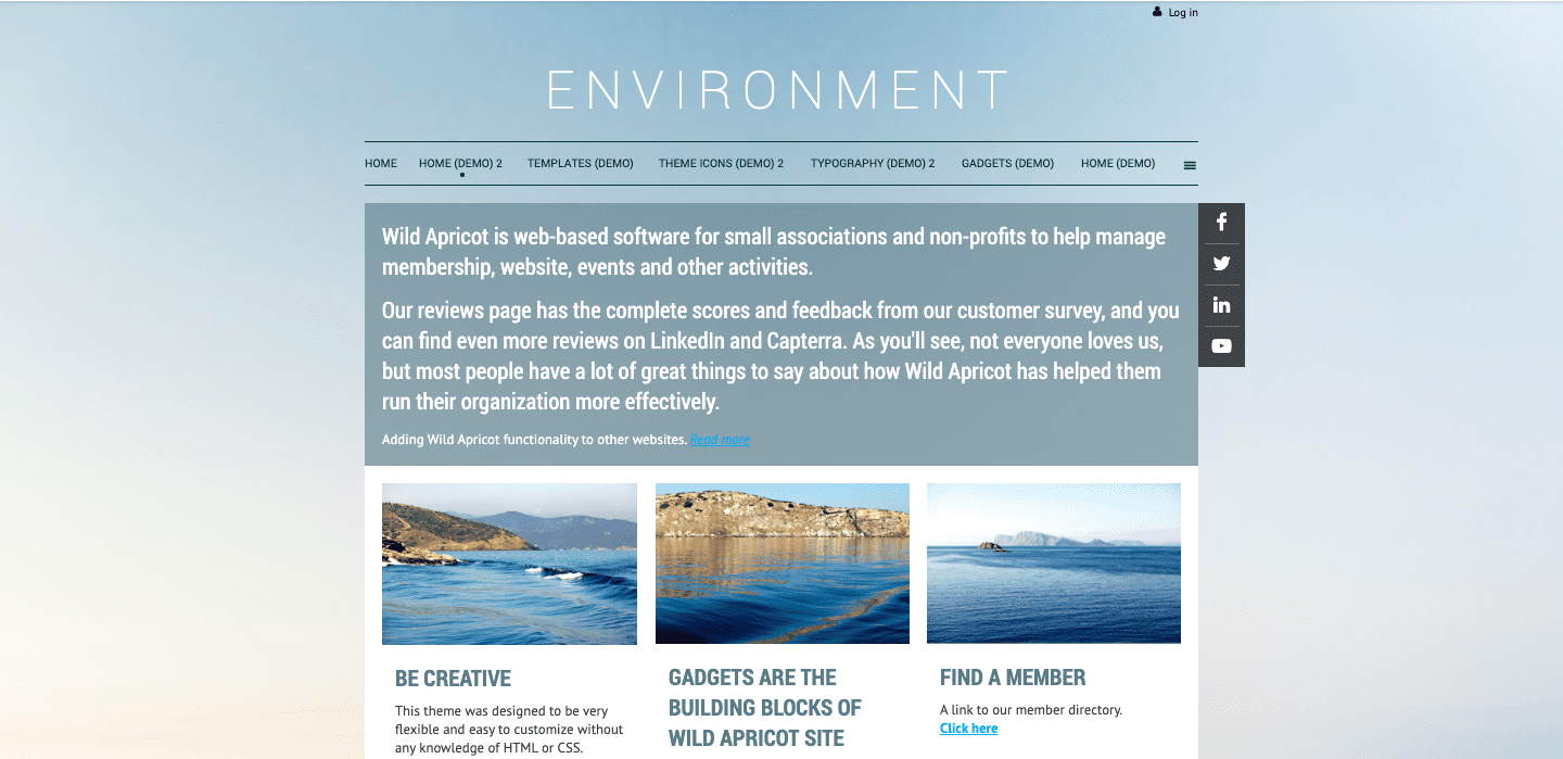
For an example of the Firma theme in use, check out this website from Térmonn. The background of their site is white, but it is displayed over a beautiful photo of wheat, which stays in place as users scroll through.
Their donation page features three areas of need, each complete with their own tracking widgets that display how much is still needed to meet their fundraising goal. Each of these is also accompanied by a brief paragraph, explaining how much is needed in donations and what work the funds will support. Clicking on each area of need will then take the site visitor to a donation form on a separate page, making for a smooth and pleasant user experience.
8. Homestead
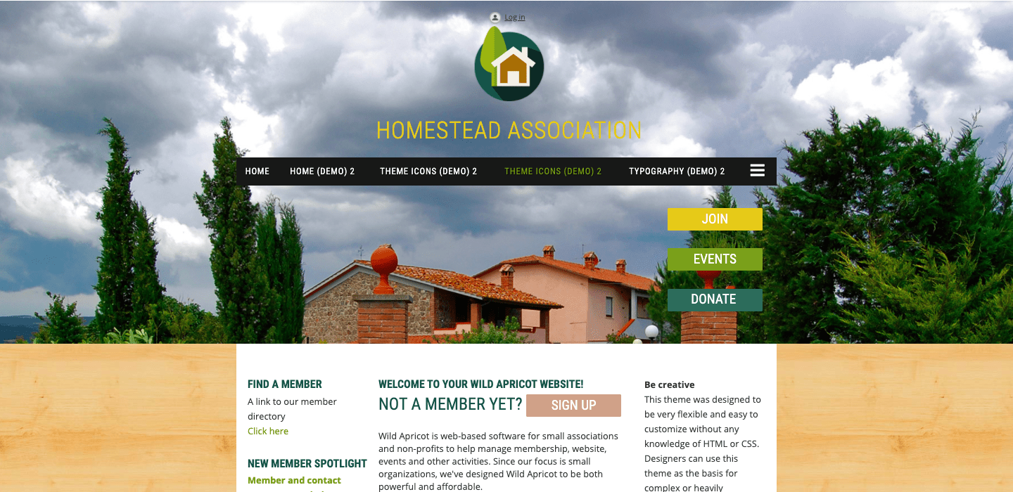
Homestead is a great theme for organizations whose website contains a lot of information and important pages. It features a sidebar where organizations can place their most important links.
It also makes use of what’s called “sticky” content, or content that doesn’t scroll with the rest of the page. A common choice is to make the header or the main menu of your website “sticky” so that as users scroll down through the page, they still have quick access to the menu and can easily navigate to anywhere else.
Who uses it well:
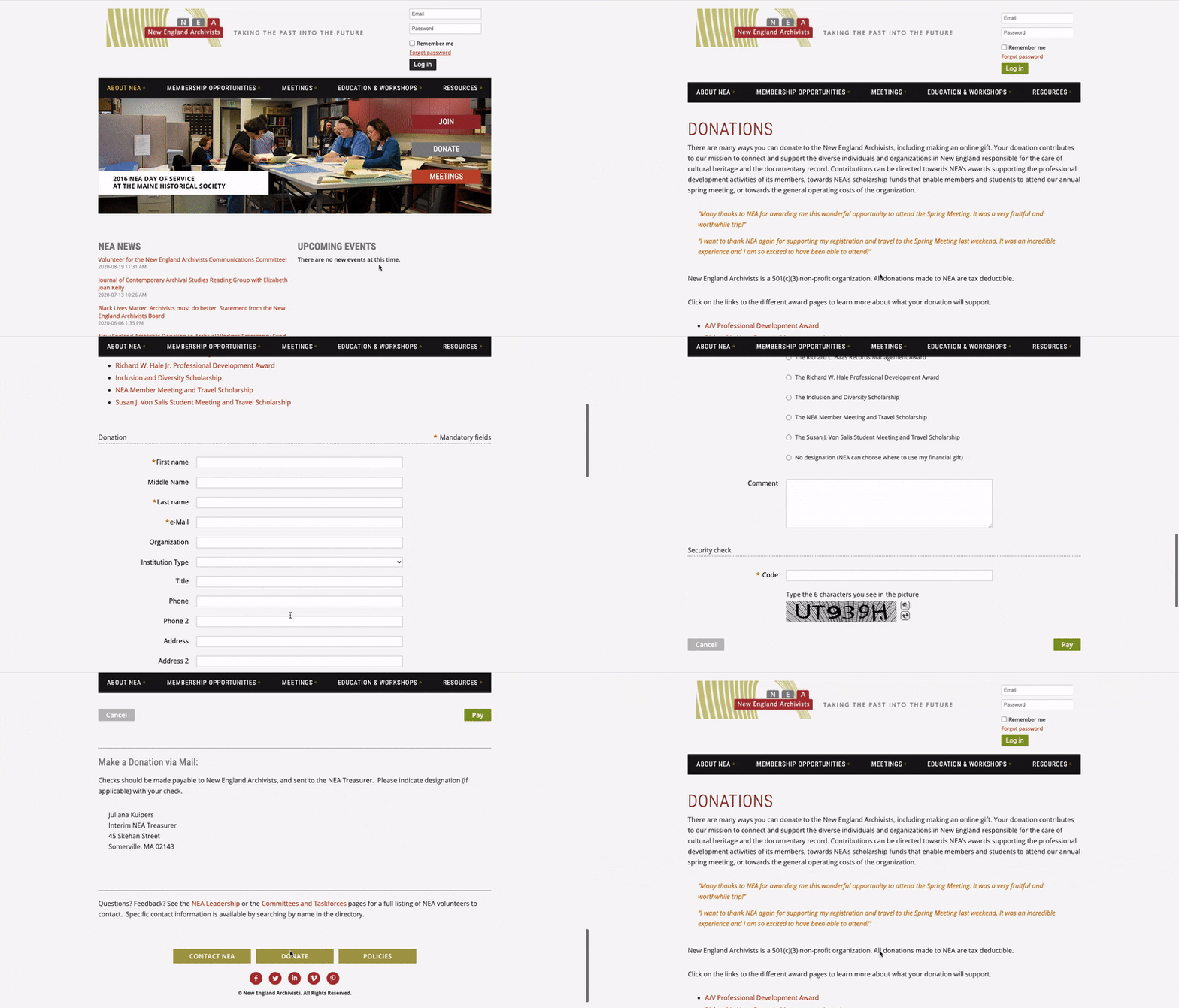
A great example of the Homestead theme in use is the New England Archivists website. Their home page contains a lot of great information, but as the site visitor scrolls down to read it, the main menu remains in place at the top.
Their donation page includes a list of the various awards and scholarships funded by donations, along with an invitation for site visitors to click on links and learn more information about each one. Their donation form also allows donors to select which award or scholarship they would like their donation to support.
9. Skyline
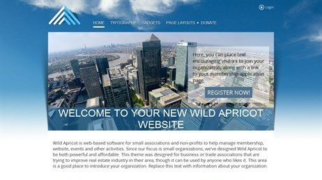
Skyline is a theme similar to Firma. It also features a background image that stays in place as the user scrolls down, but it uses cooler colors and has a bit of a more professional feel to it. It was designed to suit business or trade associations that are trying to improve real estate industry in their area, though it can be used and customized by any organization.
Who uses it well:
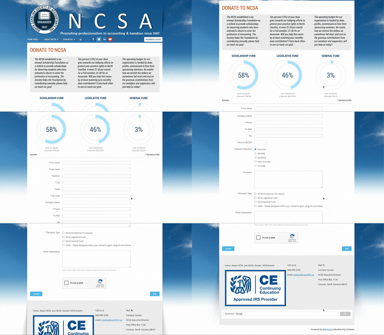
An example of the Skyline theme in use is the North Carolina Society of Accountants website. They’ve kept the sky imagery originally used in the background of this theme and personalized the home page to include important information like their upcoming events, relevant links and a social media widget.
Their donation page features three main funds they’re raising money for, including descriptions of each fund and progress tracking widgets.
10. Whiteboard
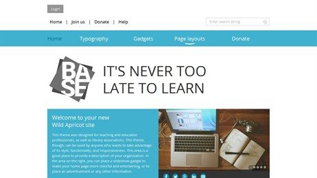
Whiteboard is a simple template featuring a clean look with just a single color and plenty of white space. It’s perfect for organizations in the teaching and education space or any professional organization that shares expert information.
Who uses it well:
A great example of the Whiteboard theme in use is The Down Syndrome Association of Greater Toledo website. Their home page is clean and minimal to allow the site visitor to focus on the important elements. They display a carousel of photos or banners containing key information, as well as clearly state their mission and include a call to action.
Their donation page is also clean and simple. A standout feature of their donation page is a banner at the bottom which prompts donors to check if their employer offers a matching gift program.


11. Bookshelf
Bookshelf was designed with education professionals and library associations in mind. It features toned down, natural colors and a plain off-white background. It’s perfect for organizations who need to share a lot of information and would like a plain but visually appealing design.
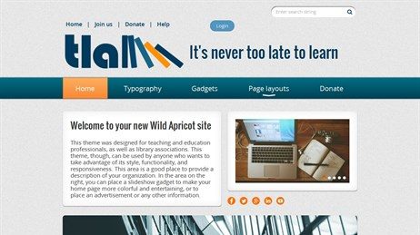
Who uses it well:
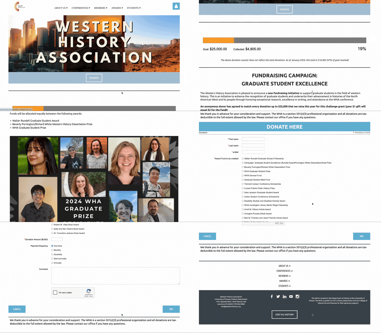
One of the many organizations who use the Bookshelf theme is The Western History Association. They’ve opted for a smaller logo that doesn’t draw too much attention and use just a single color across their header, footer and section headings. The main focus of their site is to provide written information.
Their donation page is also simple. It’s lengthy because they offer a lot of choices in terms of which funds donors can support, but it otherwise only asks the most important donor information.
12. Fiesta
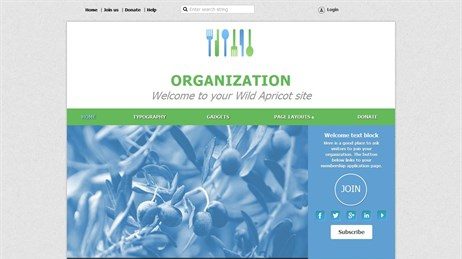
Fiesta was designed primarily for organizations in the food industry, though it still works perfectly for any other type of organization. This theme uses welcoming colors and features a large rotating display of photos.
A standout feature in this theme is the secondary navigation bar at the top of the page. Organizations can easily place internal or external links here, specify the link names and destinations, choose a vertical or horizontal orientation, and select from a list of menu styles.
Who uses it well:
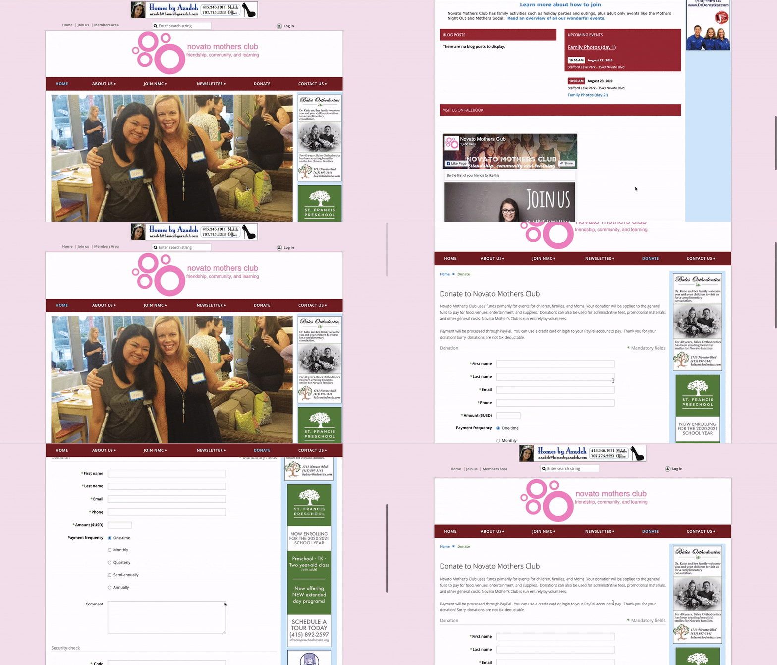
A great example of the Fiesta theme in use is the Novato Mother’s Club website. They use the space on their home page to showcase a large carousel of photos and make good use of the secondary navigation menu.
Their donation page features the “sticky” menu introduced with the Homestead theme, so that as users scroll through the donation form, they have easy access to other pages on the site.
So there you have it! If you’re ready to try out one of these template and create and customize your own donation website, start the free 60-day trial of WildApricot today!
How to Get Your Free Trial of WildApricot
To get started with your free, 60-day trial of WildApricot, simply click below:
You’ll be taken to a registration page where you can enter your account details. Once you click submit, you’ll activate a free 60-day trial of the paid version of WildApricot’s software. This means that you will have all the access to all the functionality that our paid clients receive for 60 days.
If at any point you need help with our system, feel free to get in touch with our friendly support team. They’ll be more than happy to help you set up your account as quickly as possible.
Good luck with your donation website!


![Best Membership Website Examples in 2026 [+ 12 Design Tips]](https://b2993016.smushcdn.com/2993016/wp-content/uploads/2023/10/Main-Blog-Thumbnails-2026-03-17T143806.792-1024x717.png?lossy=1&strip=1&webp=1)


