Your nonprofit website can make or break your organization. That’s the unfortunate reality these days when so much happens online.
But, organizations that do the right things online see their memberships grow and donations flow.
Recently I came across a nonprofit library association that was on the verge of going under until they revamped their website. After a year with their new website, they grew over 250 members and received a 60% boost in donations, saving the organization.
This got me thinking — “What makes some nonprofit websites so successful?”
In pursuit of this answer, I analyzed hundreds of top nonprofit websites and spoke with dozens of web admins (having access to WildApricot’s 20,000 customers definitely helped!).
One thing came out clear — the most successful nonprofit websites are visually appealing, and have a number of common features — 22 to be exact.
And if you’d prefer to learn in webinar format, join our on-demand webinar with nonprofit design expert Sarah Henry from Elevation Web to learn how to design an irresistible nonprofit website.
For a brief overview of the above, watch the video below.
By following everything in this guide, I believe you’ll stand the best chance of success to grow your membership and donations with your nonprofit website.
9 Design Elements that Engage Website Visitors
Guess how long it takes for a website visitor to form an impression of your entire website?
50 milliseconds. That’s not a lot of time to impress someone, or potentially lose them.
If your website looks dated or difficult to navigate, visitors will become unengaged and leave your site.
To help you give your website a fresh look and feel, follow these nine steps to create a stunning website design that will impress visitors and keep them engaged.
1) Easy-to-Read Layout
Simplicity creates a great first impression. When visitors see a webpage with pleasing, simple design and an easy-to-read layout, they’re more likely to stay and absorb the information presented.
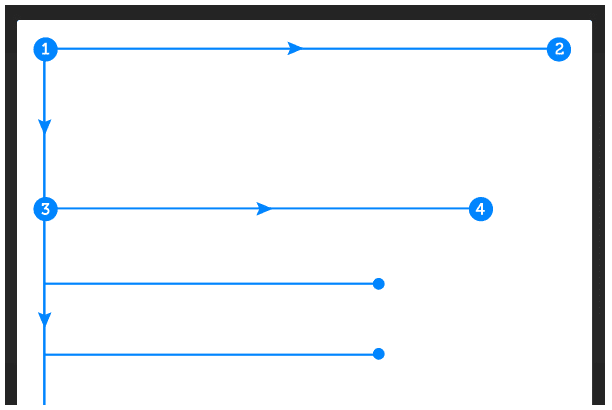
The best way to make your website easy to read is to use what’s called the F-Layout.
Naturally, most people read left to right, so a website which follows this pattern will be easier to read. Below is an example of a barebones wireframe of the F-Layout by Web Designer Brandon Jones. As you can see, the first thing someone might read is at the top left of the page (1), followed by the top right of the page (2), etc.
Below is an example of how the F-Layout can be applied for the easiest reading experience. Notice that the “SIGN UP” button is in the top right? This is exactly where you should put your “JOIN NOW” or “DONATE” button for maximum exposure.
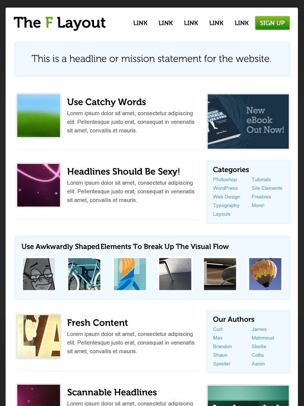
If you apply the F-Layout to your website’s design, you can be rest assured visitors will find it easy to read.
Read More: 11 Best Website Builders for Nonprofits, Reviewed & Compared
2) Friendly, Welcoming Design
When you pick up a book, what’s the first thing you notice? For me it’s the color and imagery of the cover
The same thing happens when visitors come to your website. Ninety-four percent of new visitors to your website will form their impression based entirely on your visuals.
When creating your visuals, choose attractive color schemes that represent your mission best. Clashing palettes will drive viewers away, while a lack of color bores. To help you out, here are 50 examples of website color schemes that work great.
Pictures also play a big role in first impressions. Research shows that using faces in your design can increase engagement by over 30%. Just take a look at this comparison below and ask yourself which one catches your eye more:
When selecting pictures to use on your site, the best ones have real people in them: board members, volunteers, or event attendees. Don’t worry about how professional your photos look, candid moments and group shots can make your organization appear more down to earth and personable. Just take this example from the Southern Business Women’s Network. You can almost feel like you’re at the event.
3) High-Quality Imagery
Speaking of images, blurry photographs and pixelated logos drive visitors away, while hi-resolution photos and crisp graphics draw the attention of the viewer. Audiences will immediately notice low quality images strewn about your site, so choose your images carefully.
4) Simple, Hi-Contrast Font
Readability remains front and center for website design, ensuring your audience doesn’t come across obstacles when attempting to read your content. One of the easiest ways of assisting readability is the use of simple fonts which contrast well with the background of the site.
Uncomplicated fonts also transpose well across different platforms, improving readability on mobile, tablet, and desktop computers.
Here are a few of the best website fonts to use (via WebsiteSetup.org):
- Arial
- Helvetica
- Times New Roman
- Verdana
5) A Great Logo
The importance of logos can be expressed by one of the most recognizable brands in the world — McDonald’s. Most people on earth recognize the golden arches logo. According to Fast Food Nation, many children become aware of the meaning of the McDonald’s logo before they know their own name.
A great logo on your website can help build your brand and increase recognition of your nonprofit on the web. In fact, using consistent branding across your website can actually increase donations by 700%.
An easy way to incorporate your logo across every page is to have a standardized header (like we have on this website). If your actual logo needs an update itself, remember to incorporate elements that identify the mission of your nonprofit, without creating an unreadable mess. To give you some ideas, here are 75 examples of the best nonprofit logos.
Read More: 15 Nonprofit Website Best Practices You Need to Know
6) An Easy-to-Find Search Box
A portion of website visitors will want to search your site for a specific section or piece of information. Having an easy-to-find search box can help them achieve their goal quickly.
There’s no need to get fancy here – simply set aside some space in the design for a rectangular box with the word ‘search’ embedded. Make sure it’s in an obvious place which doesn’t clash with overall design.
Embedding a search box close to the menu navigation works well, especially if you decide to use a splash image which points conspicuously to this section of the welcome page.
7) A Big Join or Donate Button
Last month, a friend asked me to donate to her participation in a walk for cancer research. I agreed, but we kept talking and the subject changed many times.
Unfortunately I only remembered to give her the money after the walk was over.
This same situation happens when people come to your website and it’s not easy to find where to join or donate. They might start reading your news, or browse upcoming events, and before they know it, it’s slipped their mind and you’ve missed out on their support.
Even when people are determined to join or donate, if they can’t find where to do it on your website within a few seconds, they’ll may become frustrated and give up.
That’s is why it’s important to make these buttons visible on every page on your website, preferably in the header.
Most organizations choose to have it at the top, in their menu, or both, like the example below.
To make it as easy as possible to find your donation page, my recommendation is to do both.
If you’re looking for more tips to increase donations to your website, I’ve written a full guide on how to turn your website into a donation generation machine.
8) A Clear Call to Action
First-time visitors to your website need a bit of direction since they’re unfamiliar with your navigation and a lot of information will be hitting them at once.
That’s why having a clear call to action (CTA) is best. A CTA is the one thing that you want every website visitor to do.
If you have an event coming up, you’ll likely want your CTA to be about joining your event. If you’re in the middle of a fundraising campaign, you’ll likely want your CTA to be about donating.
CTAs work best as large images at the top of your homepage. It’s the first thing a new visitor will see, and if your CTA is clear and concise, it just might persuade them to do the thing you want them to.
CTAs are relatively simple to do and you’ve likely seen many examples before. Here’s a great example of a clear CTA from Mental Health America of Hawaii. They’ve used a big image on their homepage to ask website visitors to sign up for their 75th anniversary event. Now every website visitor knows they’re holding this event and many will learn more and sign up.
9) Concise Copywriting Which Motivates Action
Just like the visual design of your page, the copywriting you offer should be streamlined to provide the most important information in a quick, concise manner. People don’t have time to parse complex sentences and read in-between the lines.
Write in an active voice instead of a passive voice, stressing strong verbs and precise nouns over adverbs and adjectives.
A simple trick that many websites employ to increase event attendance, membership, and donations is to make it seem like time is running out. They create a sense of urgency in their copy by using phrases like, “limited time” and “act now” to entice the reader to sign up for their events, membership, or to donate. If you need help writing your web copy, check out this great webinar on
Copywriting for the Web.
With a good grasp on the design elements which create impressive websites, it’s time to create your website pages.
9 Website Pages Every Nonprofit Needs to Attract Members and Donors
Research reveals that 74% of visitors feel frustration when web pages don’t reflect their interests or expectations — unfortunately frustrated website visitors leave and don’t come back.
That’s why it’s important to offerthe right type of content on your website that potential members and donors expect before they give their support. Before I cover the nine webpages that most top nonprofit websites create, I’ll cover the three things that both potential members and potential donors want from your website:
What Potential Members Want
Potential members want three main things:
- They want to know you have a thriving, engaged community. Research shows the number one reason anyone joins an association is because they want the opportunity to network with like-minded individuals. If you can prove this on your website, there’s a great chance someone will join online. You can showcase this by doing the following:
- Including pictures of members and events
- Member testimonials and quotes about the value your organization offers
- Information about upcoming events
- The second most important thing potential members want is access to specialized information, or educational content. You can attract new members on your website by publishing industry reports, educational webinars, or creating a members’ only section with restricted access to valuable resources.
- The third thing potential members want is instant access and an easy way to join and pay for things online. Why? Online shopping and same day delivery has made people expect instant gratification from the organizations they interact with. I’ve seen nonprofits fall behind, because they require all new members to download a PDF form, print it out, physically fill it out, and then mail it in — a process that can take a whole week. On the other hand, I’ve also seen organizations who’ve modernized this process by allowing new members to join online. The result? An instant increase in members and event registrations
What Potential Donors Want
Potential donors also want three things. And the nonprofits I’ve seen focus on these things have been successful in growing their online donations. Potential donors want:
- To know your organization’s mission. This lets potential donors know why you exist and why they should give to your organization. In fact, this information is the most important thing potential donors want to know before donating.
- To know where their donations are going. Research shows the number two thing potential donors need before making a donation is to feel comfortable about where their donation is going. Including explicit information about the breakdown of what happens to a donation can help increase donations.
- An easy way to donate. Nothing is more frustrating than multiple steps, downloadable forms, or complicated processes. A simple donation page built with a donation button, or form with instant online payments is best.
If you craft your website with the right information and allow online registration and donations, your website will start to grow your organization for you.
Now it’s time to go over which pages your nonprofit will need to be complete.
1) Homepage
This is the first page your website visitors will land on, so think about what information you want them to see right away. Many nonprofits put their main call to action on this page, along with news, featured members, upcoming events, and lots of pictures.
2) About Us
This page is where you tell the story of your organization and the people who guided the nonprofit to success.
Most nonprofits include their mission, vision and values on this page, as well as profiles of the founder and the current board members.
Here is an example of a great About Us page from the Greater Kendall Business Association.
3) Join Us
This page has all the information about what a new member might need to know before joining your organization as well as the online form to join.
Including a list of benefits to joining can help entice potential new members, just like in this example of a Join Us page from the Kapolei Chamber of Commerce.
4) Donate
This page has all the information about what a potential donor needs to know before donating to your organization as well as the online form to donate. If you’d like to make sure this page is optimized for maximum donations, here’s a complete guide on how to build this page out, and here’s an example of a great donation page from Rotary.
5) Events
This page is where you list all your events. The best way to do this is by posting a calendar showing the dates and times of your upcoming events. It’s also a good idea to list some benefits of joining one of your events.
Remember to allow online registration and payments so visitors can register for your events with ease.
It’s relatively simple to create this page using membership management software, just like the Wayne County Chamber of Commerce, which actually used WildApricot’s software to create their website and events page.
6) News/Blog
This is the area for you to post important updates about your nonprofit. Having an active news/blog section lets potential supports know about your recent efforts and engagements with the community.
7) Resources (if applicable)
If part of the value your nonprofit creates is from publishing resources, this is the place to host them.
Here is an example of a good resources page of publications from the Medical Library Association.
8) Members-Only Area (if applicable)
There are quite a few reasons why you would have a members-only section set up on your website. In some cases, this type of section may be needed for privacy and security reasons, preventing the release of confidential information.
In other scenarios, a members-only section might host exclusive resources, or a member director for paying members of the organization. Just seeing the “Members-only” tab on your website is enough to entice some potential members to join your organization online, knowing they’ll get instant access to these things.
9) Contact Us
This page includes basic contact information for your organization.
Whatever pages you decide to publish, having an organized structure will allow website visitors to find information faster, and can even boost your ranking on Google. If you’d like to learn more about this, here’s a full guide on how to organize your website.
And if you find creating your own nonprofit’s website is overwhelming, you have a few options:
- Build your website using nonprofit membership management software, which is an easy-to-use, drag-and-drop system, ready with all the pages and templates your nonprofit will need (including membership forms, event calendars, member only areas, and more)
- Create your website with WordPress and use plugins for all the membership-related modules (like membership forms) you’ll need
- Hire a freelancer to build a website to your liking.
Once your website is setup, you’ll have a base to start building your online presence and attracting new members and donors. In the next section, I’ll cover how to optimize the website you’ve created to convert these potential members and donors at higher rates.
4 Ways to Optimize Your Website to Convert Members and Donors
Conversion rate optimization (CRO) is one of the hottest topics when it comes to increasing the effectiveness of your website. After getting the basics down, the top nonprofit websites invest in applying CRO tactics to increase donations, members, and overall engagement with from their websites.
Here are four tactics successful nonprofits are using (like the library association in the intro) to convert more paying members and donors.
1) Design That Responds to Desktop, Mobile and Tablet
If your website isn’t mobile friendly, Google is actually punishing you. As of 2015, Google implemented a search algorithm change which pushes non-mobile-friendly websites down in Google search results.
What’s more is that since 2014, more people actually surf the web from their phones than from a desktop computer. If your website design isn’t taking mobile visitors into consideration, you could be missing out on many new members and donors.
That’s why it’s important to have a website which responds to desktop, mobile, and tablet configurations.
To find out how mobile-friendly your website is, here is a quick test you can take with your website.
If your mobile website isn’t up to par, the easiest way to make it mobile-friendly is to build your website on a platform that already supports mobile responsiveness, such as WordPress, or by using membership management software, such as WildApricot (see below for an example of one of our pre-built templates).
2) Add a Personalized Touch to All Communication
The top nonprofits realize that to build more trust and loyalty from supporters, they must personalize each person’s online experience with their organization. They’re doing this through their website with something called Customer Relationship Management Software (CRM).
Here’s how it works:
Contact information gathered when either a new member signs up, someone attends an event, or a new member donates via their website is used to personalize all further online communicationwith that person (via email/newsletter/website profile). The effects are drastic. Just personalizing member and donor emails can increase email transaction rates by 600%.
This means that you may receive six times the amount of donations from personalized email requests versus standardized emails.
Membership management software has built-in CRM software that lets you build a nonprofit website with forms that collect information right into a contact database. From the contact database, you can compose emails and newsletters and schedule them to go out to all your contacts.
3) Popups
Despite their controversial nature, popup windows still increase conversion and engagement rates across the board by an average of 3% (with top popups increasing conversions nearly 10%). This means that out of every 100 visitors to your website, you can expect an extra 3 to engage with your website at a higher rate (become a donor, become a member, register for an event, give you their email, etc.).
There are three main types of popups I’ve seen nonprofits use to their benefit:
 Timed Popups: Timed popups display a popup after a certain period of time. For example, after a visitor spends 30 seconds on a page, you can display a popup that encourages the visitor to sign-up for an email campaign, or an event.
- End of Article Popups: If a reader nears the end of the article, you can show a window that recommends another popular, related piece of content, to keep the visitor engaging on your website. This can reduce bounce rates while continuing the conversation.
- ”Exit-intent” Popups: When the webpage detects a viewer moving the mouse towards certain areas of the page (like the exit button), a popup interrupts them with an offer designed to encourage a yes-or-no response. Examples include signing up for an event, or downloading a resource.
Overall, popups are a great way to boost engagement on your website with minimal effort. If you’d like to put popups on your website, here are 20 tools to do so.
4) A/B Testing
The most successful nonprofit websites, those that convert new members and donors at high rates, are always engaging in A/B testing.
A/B testing, also referred to as split-testing, offers a method of discovering small, but impactful, changes which improve conversion and performance for all aspects of your website. These tests involve comparing the results of two different website elements through direct observation. If the ‘A’ version of the webpage attracts fewer new members than the ‘B’ variant, the latter is considered the winner with the former webpage discarded.
A/B tests can involve two wildly different webpages, or test the performance of a specific aspect of your website design. For example, you may discover that a brown donation button increases clicks compared to a red button, increasing donations without investing a lot of resources.
Here is a list of recommended things to test on your website:
- The Donate or Join button (color, placement, text)
- The images on your homepage
- The copy of your homepage
- The benefits you list on becoming a new member or donating
- The pricing of your membership
- The recommended donation amount
- New member contact form fields (number and variety)
If you’d like to setup some A/B test experiments for your nonprofit website, here are 20 tools to do so.
Read More: 20 Foundation Websites to Get You Inspired
The Easiest Way to Build an Amazing Nonprofit Website
You could try to spend your time researching website builders, designing, updating, and testing your website all by yourself, or outsource the design of your website to an agency.
However, what most nonprofits do is use a website builder, like the one we’ve created at WildApricot (plus you can try us for free).
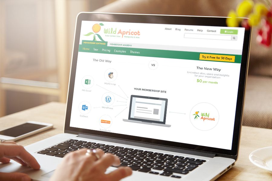
Our website builder is used by over 20,000 organizations and comes ready with professionally designed templates and features built specifically for nonprofits, including:
- New member signup pages and forms
- Donation pages with donation goal bars
- Online event registration and a calendar of upcoming events
- Integration with a number of online payment processors including PayPal
- A member only and member directories
- Plus, all our professionally designed themes are mobile friendly
Once someone fills out your new member, donation, or event registration form, their information is instantly updated in your membership database, which makes it easy to:
- Keep all member records up to date with their payments and donations
- Send automated invoices, receipts, and thank-you messages
- View donation summaries
- Filter contacts and create lists
- Personalize email/newsletter communication to all contacts
If you’re looking to create a powerful nonprofit website and save time while managing your organization, consider starting a free trial of WildApricot.



![Best Membership Website Examples in 2026 [+ 12 Design Tips]](https://b2993016.smushcdn.com/2993016/wp-content/uploads/2023/10/Main-Blog-Thumbnails-2026-03-17T143806.792-1024x717.png?lossy=1&strip=1&webp=1)


