When done right, your nonprofit landing pages can become your most powerful tools for growing your organization online — donations, email subscribers, members, volunteers, etc.
If you’d like to set up a landing page to increase donations (or any other type of goal), I’m going to cover the five steps that will create a successful nonprofit landing page, including examples from nonprofits who have found success.
And if you want eight easy ways to increase your email signups, join our webinar on October 29th with executive director and all-around nonprofit expert Sean Kosofsky.
Step 1) The Right Way to Pick a Goal
Many nonprofits are tempted to make this mistake when they create their first landing page.
They ask for too much.
For example: “Donate and join our email list!” — that’s two different options.
The problem is that creating more options increases choice overload — should I donate? Should I subscribe? Should I do both? Should I do neither?
A famous study by Columbia University discovered that when people are presented with too many options, they end up purchasing less. On the flip side, when people are presented with less options, they end up purchasing more.
That’s why landing pages that ask only one thing have higher success.
So, when you go about setting up your landing page, pick one goal and write it down at the top of the page.
That way every visitor to your page will know exactly what you’d like them to do.
Here’s a great example of a nonprofit landing page with one explicit goal at the top of the page from Invisible Children.

If you click on Invisible Children’s donation page and scroll down, you’ll see they’ve included stories of people their organization has helped and more reasons to give — just enough to convince someone to make a donation.

Next, you’ll need to figure out how much information you’ll need to collect from the visitor in order to reach your goal. Common fields include:
- Name
- Phone number
- Address
- An option to set up recurring monthly donations (when applicable)
- Custom fields like “How did you hear about us?”
Generally the less information you require people to give, the more people will fill out your form. But depending on what type of goal you have, you may need to ask for more info.
For example, if you’re trying to entice someone to sign up for free e-book on your landing page, you probably just need to collect that person’s name and email address. If you’re asking that person to donate money to organization, you’ll need considerably more information.
Remember to ask only for the information you really need – if your form is long and involved, people may get overwhelmed and abandon your page.
Step 2) How to Make The Right Pitch
Making a pitch on the internet is considerably more difficult than in person.
Besides the fact there’s no human interaction, the internet has drastically decreased our attention spans. This means that if you don’t give your visitors the information they want, you have about eight seconds before they leave.
The best way to capture someone’s attention right away is to immediately pitch them with some sort of offer that can benefit them.
Here are some examples:
- If you want to get donations, tell a visitor how their donation will impact your community.
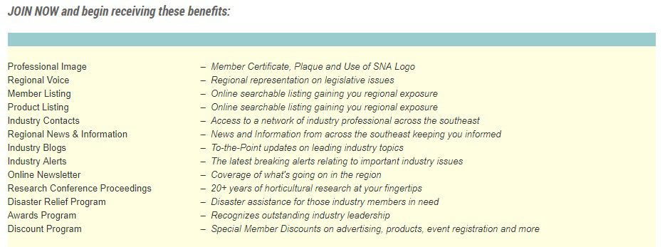
- If you want to get more members, list the benefits of joining your organization.
- If you want to get more email subscribers, offer a free resource like a guide or a whitepaper in return for their email.
Here’s an example of the member benefits from a join us landing page from a membership organization, The Southern Nursery Association. You can see how they’ve included all their member benefits in compelling, easy to read bullet points:

For other types of landing pages, follow a similar formula.
- If you’re giving away a free report for an email address, state the full name of that report, and describe the benefits of that report in short, concise language.
- If you’re asking people for donations, list out the ways a donation will benefit your community and tell stories of people whose lives have been changed by donations.
- If you’re asking people to volunteer, list the benefits of volunteering and show lots of pictures of happy volunteers at your events.
Step 3) Why You Need to Hold Your Prospects’ Hands
The worst thing you can do is build an engaging landing page that leaves people confused at the end.
Do they need to click a button? Fill out a form? Check a calendar? Get in touch with you?
You’d be surprised at how many nonprofits leave it up to the website visitor to figure this out.
On the flip side, those that spell out exactly what a visitor should do to complete an action — example: “Enter your email below and click the submit button” — receive more donations, subscribers, and members, because no one falls through the cracks along the way.
This is called hand holding.
The best way to test if your landing page needs more hand holding (if something is confusing), is to ask two types of people to read through it. Those two people are:
- Someone young
- Someone old
If a young person and an old person can read through your landing page and know exactly what to do, you’ll stand the best chance at limiting confusion from your online visitors and increase success with your goal.
Here’s a helpful example of a very simple, yet effective form on a donation page from the Ontario Association of Food Banks that holds a website visitor’s hand all the way through the action they want them to complete.

Step 4) Tips to Keep Design Simple
Because your landing page only has one goal, you need to eliminate all other possible clickable options from the page. In many cases (when possible), this means you should remove your navigation bar, social media icons, or other links.
You should also keep your design as simple as possible. Don’t confuse the prospect with flashy graphics or a lot of overwhelming colors. Clean and simple is the name of the game when you’re putting landing pages together.
If you need a good example, I often refer to Charity Water’s donation page — it’s one of the simple, yet effectively designed nonprofit landing pages I’ve ever come across.

One thing extra that you do need to include however, is your organization’s logo at the top of the page.
That’s because people feel more comfortable donating online (or giving their email address, or joining, etc.) when they know what organization they’re working with. In fact, a study by Network For Good of 45,000 nonprofits found that branded donation pages received 700% more donations than generic ones.
5) How to Maximize Success of Your Landing Page
From my experience, there is no set formula that works for everyone.
Some landing pages with lots of images work for some organizations, while landing pages with lots of text work for others. The same thing goes for buttons, bullet points, recommendations, social proof, etc.
The point is that every nonprofit serves a different community and what may work to attract support for one community may not work for another.
That’s why the nonprofits that continually test different elements of their landing page find the most success.
Testing a landing page is simple.
To start, design and launch your finished landing page. Then track over time how many people view this page, and how many people take action. You can do this in Google Analytics.
Once your first page has been up for a while (I recommend about a month, or until you reach about 500 visitors), you’ll have enough data to see what your conversion rate is. This will tell you how effective your landing page is.
A conversion rate is simply the total number of visitors to your landing page divided by the visitors who completed an action (donate, subscribe, join, etc.), then multiplied by one hundred.
For example, if you have 500 total visitors and 12 people donated, your conversion rate is:
12 ÷ 500 x 100 = 2.4%
But, is 2.4% a good conversion rate? Perhaps you could get more conversions if your landing page was designed better.
There’s only one way to tell if your conversion rate is good (generally, a conversion rate of 2.4% is average, but it depends for each type of organization) and that’s to put your first landing page to the test.
The way most nonprofits test their landing pages is to do what’s called an A/B test.
An A/B test is when you clone your first landing page, then change one element on it to see how it performs.
For example, you might change all the coloring on your landing page, because you may believe that more people take action when the color is red rather than blue. Or, you might rewrite your basic pitch at the beginning to see if more concise copy convinces more people to take action.
A/B Testing can get quite sophisticated, but to start, I recommend testing out one variation of your landing page for about a month, or as long as it takes to drive as much traffic to it as your last page (a good metric for traffic might be 500 people).
At the end of the test, you’ll be able to calculate your new conversion rate. If the conversion rate of your new page is higher, scrap the old one. Then start out a new test.
Some nonprofits are able to raise their conversion rates drastically by testing.
For example the International Rescue Committee increased online donations by 94.6% by A/B testing their donation landing page. Here’s a snapshot of their analysis on their old landing page before they decided to start testing things.

The most successful nonprofits continually run A/B tests on all their landing pages. This makes sure they’re always striving for higher conversions.
Master the Art of Creating Nonprofit Landing Pages That Convert
Landing pages can be a powerful tool for your nonprofit organization. Simple, persuasive, well-designed landing pages can help you grow your email subscriber list, increase your membership base, and bring in more donations.
Creating effective landing pages is part art, part science, but by using the steps above, you’ll be able to craft new pages with ease.
Once you start creating landing pages, you’ll see what an incredible difference they can make for your email marketing, subscription, and donation goals.
Additional Resources:
- 10 Inexpensive (or Free) Nonprofit Marketing Tools That Create Stunning Visuals (WildApricot.com)
- Use These 5 Steps to Create a Nonprofit Marketing Plan (WildApricot.com)
- Six For-Profit Digital Marketing Strategies Nonprofits Can Put Into Action Today (Forbes.com)
- 10 Landing Page Examples For the Social Good (Unbounce.com)


![Best Membership Website Examples in 2026 [+ 12 Design Tips]](https://b2993016.smushcdn.com/2993016/wp-content/uploads/2023/10/Main-Blog-Thumbnails-2026-03-17T143806.792-1024x717.png?lossy=1&strip=1&webp=1)


