
Imagine your nonprofit’s mission clearly shining through to anyone who looks your way, not just from your programs, but across your logo, messaging, social media, signage and emails.
Your nonprofit’s brand plays a significant role: it builds trust, attracts the right supporters and showcases who you truly are to the world.
If you’re looking for a complete nonprofit branding guide that helps you define your mission, clarify your message and roll out a consistent brand across every touchpoint, then you’re definitely in the right place!
This guide shares six practical branding checkpoints to help you stay organized (and avoid being overwhelmed). You’ll also find standout nonprofit branding examples to inspire clarity, connection and purpose – so your organization can truly stand out.
What Kind of Branding Journey Are You On?
Before we dive in, ask yourself the following question and keep it in mind as you read along:
Are you trying to build a nonprofit brand from scratch – or are you trying to clarify and strengthen what you already have?
Emotional connection drives impact. Research shows that 76% of consumers are more likely to choose a brand they feel connected to over a competitor. For nonprofits, this means developing branding and marketing strategies that authentically tell your story and showcase real-life connections – think testimonials, case studies and heartfelt storytelling. Creating these bonds is key to turning awareness into lasting support.
This guide will walk you through each step in the nonprofit branding journey. You’ll learn how to define your identity and roll it out across every touchpoint, with clear checkpoints along the way to ensure you’re making progress.
So, let’s get started!
 Sunny Tip: Build a Brand Your Members and Attendees Trust
When refining your nonprofit’s brand, start with your audience. Survey members and event attendees to gain insight into their expectations and perceptions. Be sure to keep loyal supporters involved during rebrands to maintain trust and minimize confusion. Look to peer organizations for inspiration, and utilize real success stories and infographics to clearly demonstrate your impact. A strong, relatable brand drives engagement and event turnout.
🏁 Checkpoint 1: Define Your Brand’s Identity
What does your nonprofit stand for? Before considering colors or fonts, it’s essential to understand your brand’s core identity. This is your foundation, and skipping it can lead to confusion. To truly connect, start by diving into the data you already have in past surveys, emails and your nonprofit CRM.
Ask yourself:
- What do we want to be known for?
- Who are we here to serve?
- What do we believe in?
- How do we want people to feel when they encounter us?
Key Brand Elements to Define
- Mission Statement – What are you doing and why?
- Vision – What’s the long-term change you’re working toward?
- Core Values – The beliefs that guide your actions.
- Brand Personality – Choose 3–5 human adjectives (e.g., compassionate, bold, grassroots, optimistic).
- Tone of Voice – Should your messaging feel formal, friendly, urgent, hopeful?
✔️ Checkpoint complete when: You can clearly explain your nonprofit’s identity and core values in a sentence or two, and your team agrees.
🏁 Checkpoint 2: Turn Strategy Into Visual Identity
Once you’re clear on what you stand for, it’s time to bring your brand to life visually. Think of this as your look and feel.
Visual Brand Elements to Design:
- Logo – A simple, scalable design that feels aligned with your brand personality. Remember, this logo needs to look legible when large on a building or tiny in a pamphlet.
- Color Palette – Select 3-5 consistent colors. Consider using psychology here: green suggests sustainability, blue builds trust, red signals urgency.
- Typography – Pick 1-2 typefaces that are legible and versatile (especially on mobile).
- Photography Style – High-impact images that match your tone.
WildApricot Tip: A mood board can help you make decisions visually before investing in design.
✔️ Checkpoint complete when: You have a logo, color palette, fonts and a consistent image style that supports your brand personality.
🏁 Checkpoint 3: Craft Your Messaging Toolkit
Now that your brand looks the part, it needs to sound the part too. Your messaging helps people understand what you do, why it matters, and how they can get involved.
Build These Messaging Essentials:
- Tagline – A short phrase that captures your essence.
- Elevator Pitch – A two-sentence explanation of who you are and what you do.
- Key Messages – The 3-5 most important ideas you want supporters to remember.
- Calls-to-Action (CTAs) – Clear, compelling invitations to act: Donate Now; Sign Up Today; Click Here to Volunteer.
Example: Instead of “We provide resources to underserved communities,” try “We help families get access to the food, housing and dignity they deserve.”
✔️ Checkpoint complete when: You’ve got a short-and-sweet toolkit that your staff, board and volunteers can repeat – and it feels true to who your nonprofit is and the mission you’re trying to achieve.
🏁 Checkpoint 4: Build Your Brand Guidelines
Branding guidelines are a way to help everyone stay consistent. This is a vital step as your organization grows and multiple people create materials.
Nonprofit Brand Guideline Should Include:
- Your logo and how to use it (and how not to)
- Color codes (HEX, RGB, CMYK)
- Approved fonts and text styles
- Sample tone and messaging
- Image usage (filters, photography style, etc.)
- Real examples of dos and don’ts
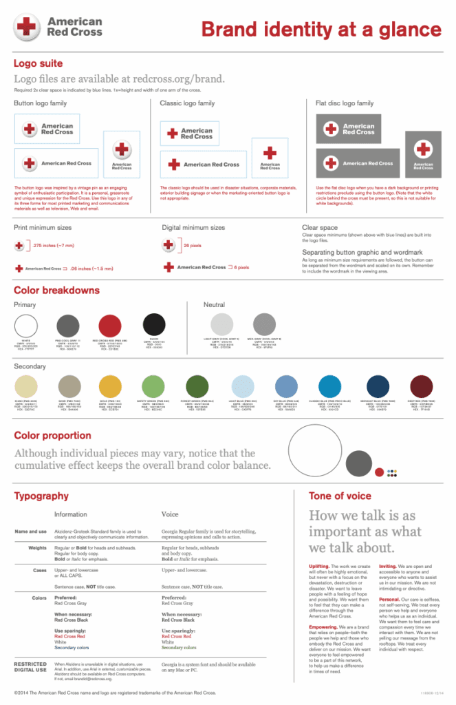
Once you’ve written this out, save your brand guidelines in an easy-to-access format. A PDF or shared Google Doc works well. Here’s an example from the Red Cross, who summed up their branding guidelines in a one-page document that can be easily shared throughout the organization.
✔️ Checkpoint complete when: Anyone on your team (or a new hire) can create branded content confidently and consistently without second-guessing!
🏁 Checkpoint 5: Roll Out Your Brand Across Touchpoints
Now it’s time to apply your new brand everywhere people interact with you – online and offline. This is where consistency turns into credibility.
While you might start with updating your nonprofit’s website, don’t stop there.
A strong nonprofit branding strategy should extend across all communication and marketing channels – from social media and emails to printed materials and event signage. Every touchpoint is an opportunity to reinforce your mission and make a lasting impression.
Where to apply your brand:
- Website – Start with your homepage; it’s often the first impression.
- Social Media – Align profile images, post styles, hashtags and tone of voice.
- Emails, SMS, and Newsletters – Use your voice, colors and fonts consistently.
- Print Materials – Flyers, brochures, business cards and posters – ensure they reflect your updated brand.
- Event Signage – Banners, tshirts, booths and swag should all reinforce your brand identity.
Schedule an audit, too: Review each platform where your nonprofit has a presence. Ask yourself:
- Are we still using any outdated logos, colors, or messaging?
- Is our tone consistent across channels?
- Do visuals and language reflect our current identity?
Assign this task to a staff member or volunteer, or create a simple branding checklist to guide the review.
Brand Communication in Action: Email and SMS
Here’s a real-world example of using a compelling, consistent brand voice to increase participation:
Well-Read Mom, a nonprofit dedicated to helping busy moms connect through literature, uses WildApricot’s SMS tools to deliver key audio discussion prompts to members’ phones, even in offline locations. This mobile-first approach increased participation while staying true to their brand’s mission of simplicity and community.
By giving members the option to receive either texts or emails based on preference, they boosted engagement. They saw 35% growth over several years. It’s a great reminder that when your brand voice is applied thoughtfully across communication channels, it builds trust and drives results.
✔️ Checkpoint complete when: Your branding looks and sounds consistent across all digital and print channels – and your audience is engaging with it.
🏁 Checkpoint 6: Keep Your Brand Healthy and Evolving
Your brand isn’t static and should grow alongside your mission. Even the best nonprofit branding and social media for associations need occasional maintenance.
How to keep your brand relevant, trusted and consistent:
- Run an annual brand audit: Review your website, social media, emails, and print materials. Are your visuals up to date? Is your nonprofit marketing plan still resonating with your audience?
- Gather audience feedback: Use surveys, interviews or even informal conversations with donors, members or volunteers to learn how your brand is perceived. For traditionally “hard-to-reach” audiences, real success stories can make a big difference. (WildApricot Tip: This insight is gold when building your nonprofit’s annual report.)
- Update assets after big changes: Launching a new program? Shifting your mission focus? Making changes to how you promote your big fundraiser? Ensure your brand reflects the change, from logo usage to messaging and tone.
- Do a soft refresh every few years: Consider small design updates (i.e., refining your fonts or website layout to make it easier to donate) to keep your brand current, without confusing your community.
✔️ Checkpoint complete when: You have a plan in place for reviewing and evolving your brand annually.
Inspiration Ahead: Nonprofit Branding Examples to Spark Your 2025 Strategy
Looking for inspiration? Here are seven standout nonprofit brands that put strategy into action:
1. St. Jude Children’s Research Hospital

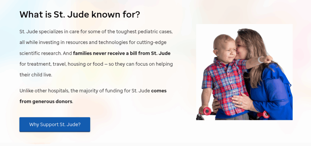
- What stands out: Consistent use of emotional storytelling, clean red-and-black palette, and high-impact imagery of real patients.
- Why it works: It evokes hope and urgency while keeping the mission at the center.
2. Campfire Circle
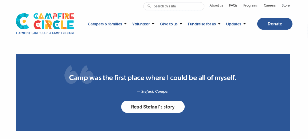
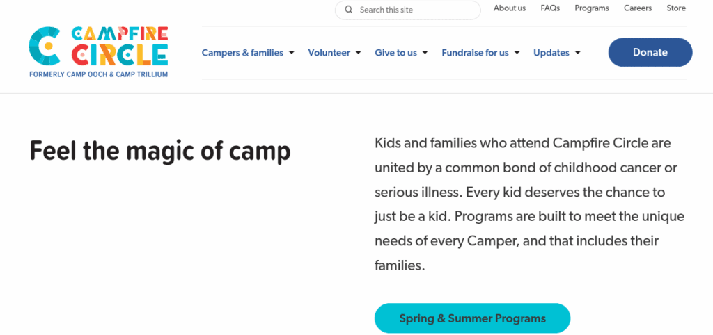
- What stands out: Bright colors, simple fonts, and warm, welcoming design.
- Why it works: Their branding visually reflects their mission. For example, their website visually reflects the joy and community Campfire Circle brings to children with cancer. A couple of years ago, they also shared exactly why they rebranded in a visually engaging narrative. The playful design doesn’t downplay the seriousness of their work – it makes space for optimism and healing, which emotionally resonates with supporters and families.
3. North York Women’s Shelter
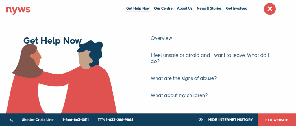
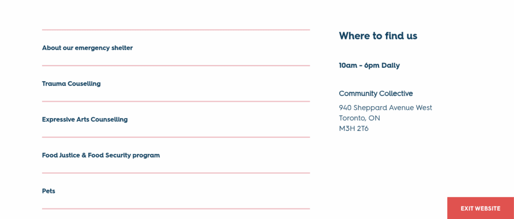
- What stands out: Gentle tones, empowering language, and inclusive visuals.
- Why it works: This Toronto-based nonprofit fosters a sense of community and safety. Notably, their website messaging provides easy-to-spot contact information for the shelter crisis line, plus tips about hiding your internet history from an abuser and resources to find more resources. The inclusion of a bright red box to “Exit Website” is intended to help victims quickly and easily close this tab and stay safe from their abuser.
4. World Wildlife Fund (WWF)
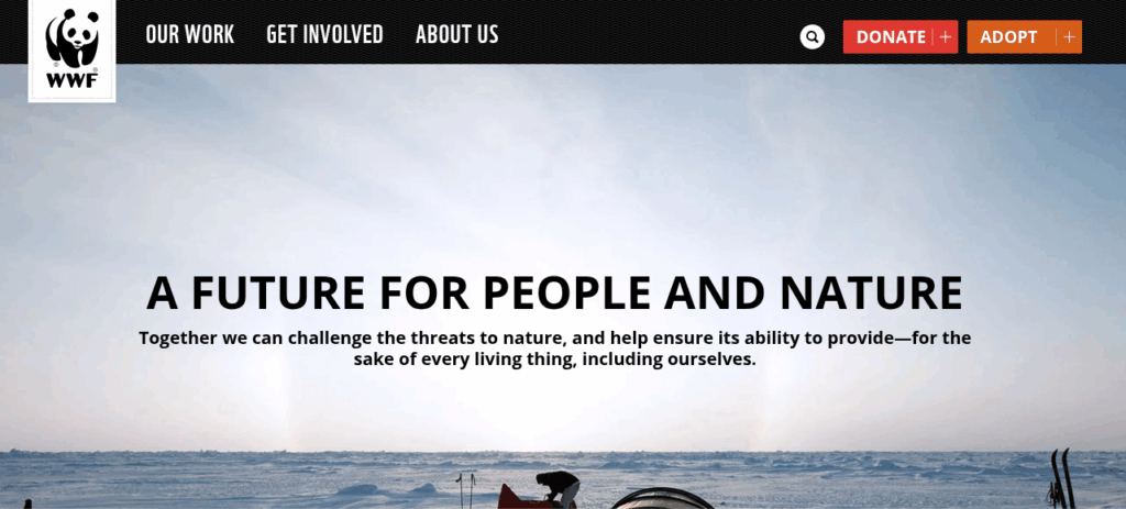
- What stands out: Iconic panda logo, high-contrast design, and nature-focused imagery.
- Why it works: It’s globally recognizable and ties directly to the mission of conservation. WWF’s branding is timeless, clear, and immediately recognizable. Their consistent use of strong visuals and urgent messaging reinforces the global importance of their mission. It’s a great example of global relevance that still tells a great, highly empathetic story.
5. Oxfam

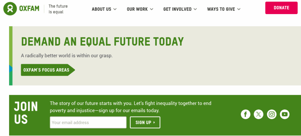
- What stands out: A warm green color palette, soft edges, and approachable typography.
- Why it works: The branding strikes a balance between friendliness and seriousness, aligning with Oxfam’s mission to fight global inequality. Strong visual storytelling and case studies put the people they serve at the heart of the brand. This creates a strong emotional connection.
6. charity: water
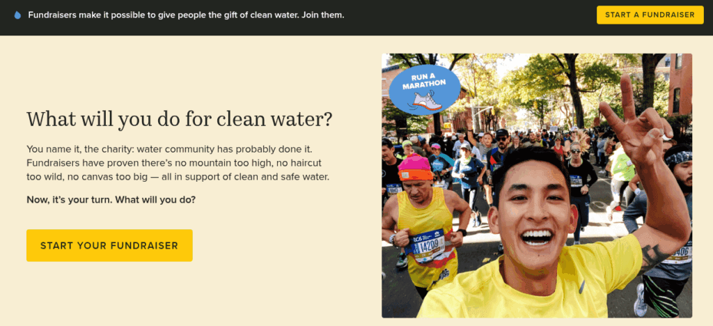
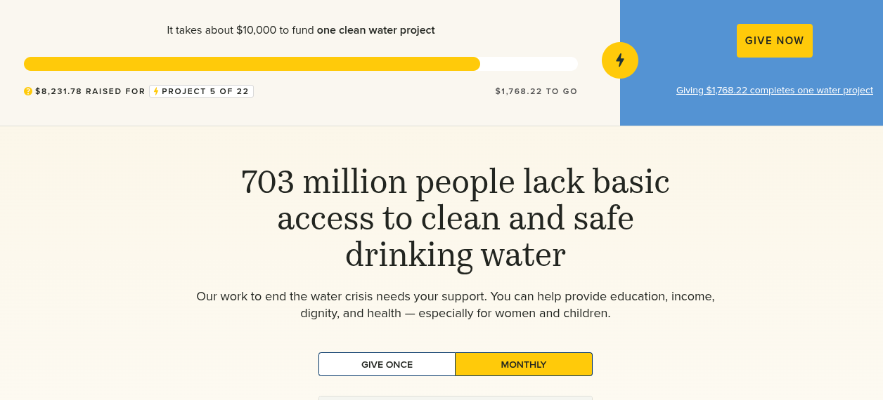
- What stands out: A minimalist yellow-and-black color scheme, bold typography, and clean design.
- Why it works: charity: water’s branding is built around transparency and hope. The vivid yellow evokes optimism, while their strong visual storytelling (i.e, clean water projects and real people impacted) drives emotional connection. Their consistent tone of clarity and positivity has made them one of the most trusted nonprofit brands worldwide.
7. The Trevor Project
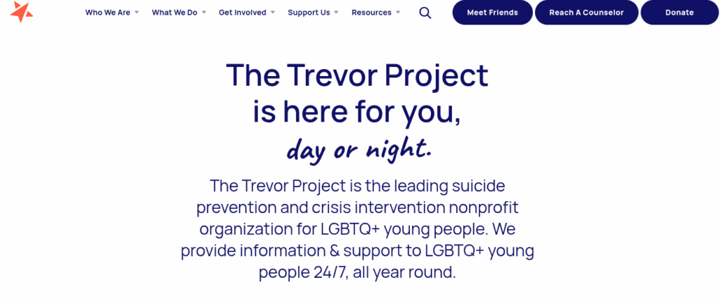
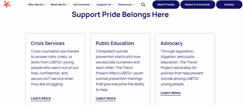
What stands out: Vibrant, inclusive color gradients, clear messaging, and youth-centered tone.
Why it works: The Trevor Project’s branding speaks directly to LGBTQ+ youth in crisis – offering safety, acceptance, and empowerment. Their visual language is modern and dynamic, creating a brand that feels not only supportive but also affirming and relevant.
Final Thoughts: Your Nonprofit Brand is Your Impact
Now that you’ve read through this guide, you know that strong nonprofit branding means being clear, consistent and mission-driven. Having a great brand helps you stand out, build emotional connections and reinforce trust.
As you work through the branding checkpoints above, you’ll soon learn that your brand becomes much more than just a “logo” to your audience. In 2025, when online reputation matters more than ever, your brand becomes a living tool that strengthens your community, streamlines communication, and inspires giving. It also adds valuable social proof, helping you build crucial business credibility with your supporters.
Ready to Bring Your Brand to Life?
Start your free trial of WildApricot today – the all-in-one membership and event management platform trusted by thousands of nonprofits. With WildApricot, you can:
- Build your own beautifully branded and customized website – no coding required
- Send out email and text messages to members with your nonprofits unique visuals
- Create an online store to sell your own merchandise and process payments through a secure payment processor
- Keep track of all your members, supporters and donors all in one membership database
- Manage and execute beautifully branded events from registration to promotion

👉 Take a 60-day test drive, no credit card required.
Get ready to dive right in!